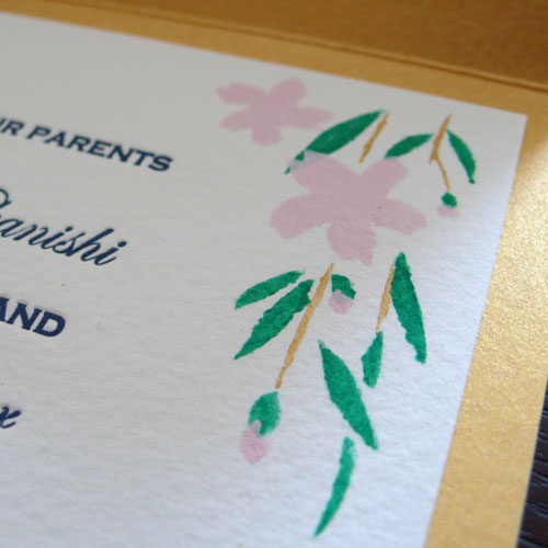
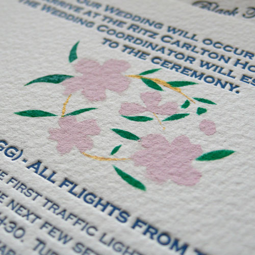
Continue from yesterday’s invitation design, I wanted to share some of the designs and hand-made things we did for the day of the wedding. I can’t believe we pulled this all together, it really was a lot of work, but it was the most amazing, memorable, loving, fun and beautiful day ever in our lives!
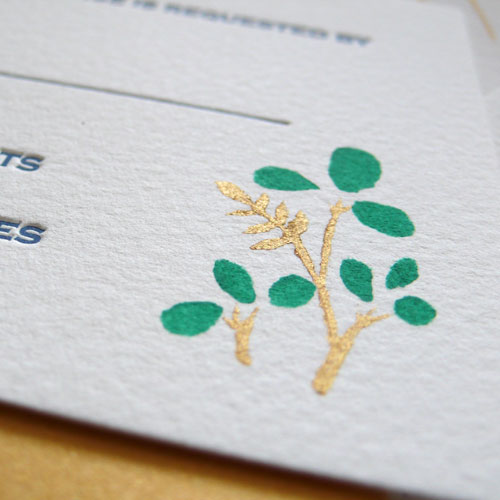
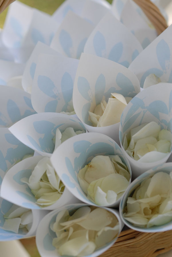
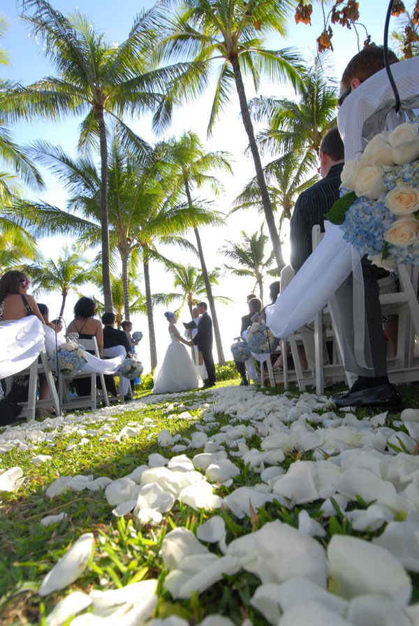
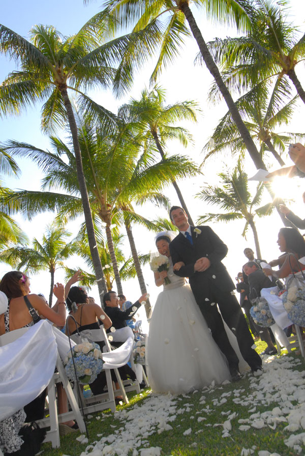
Tossing Cones: I took the same graphic I used on my invitation, the growing plants, and made it grow more so it looks like it’s about to bloom. Printed on 8.5×11 papers and cut them into square, roll them so it holds the rose petals and handed to everyone at the ceremony.


I also designed and made the programs, but nothing was left at the end of the day… I made a few extras, of course, but I don’t have it any more… on my computer, I do, though.
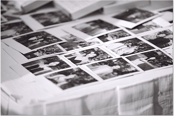
Guest Book: Each guest had their polaroid picture taken, placed on the guest book and they wrote us really nice things – thank you so much!!!

Reception:

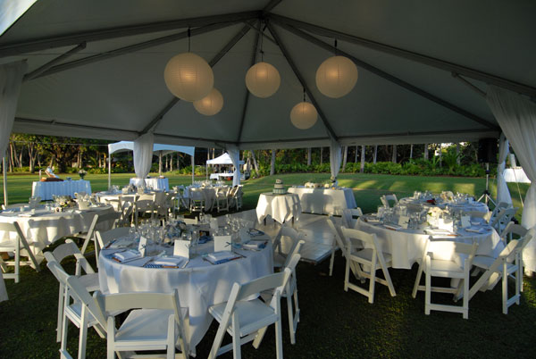
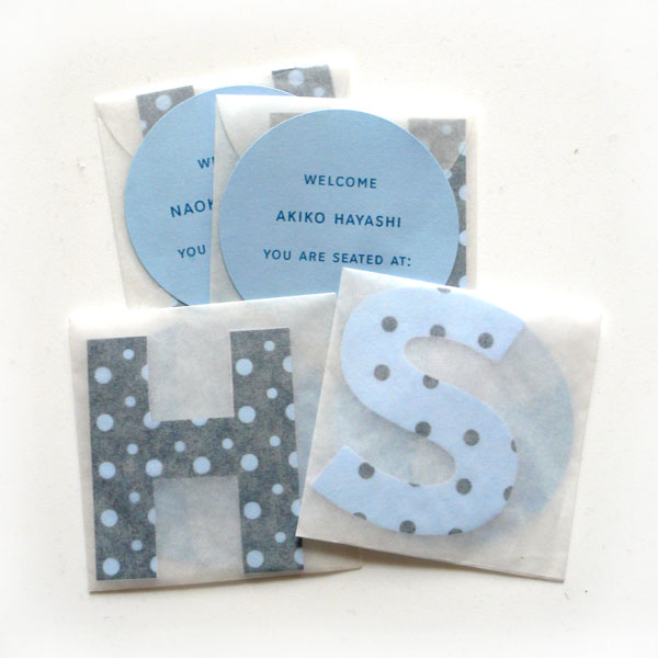
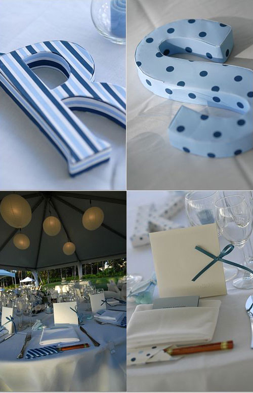
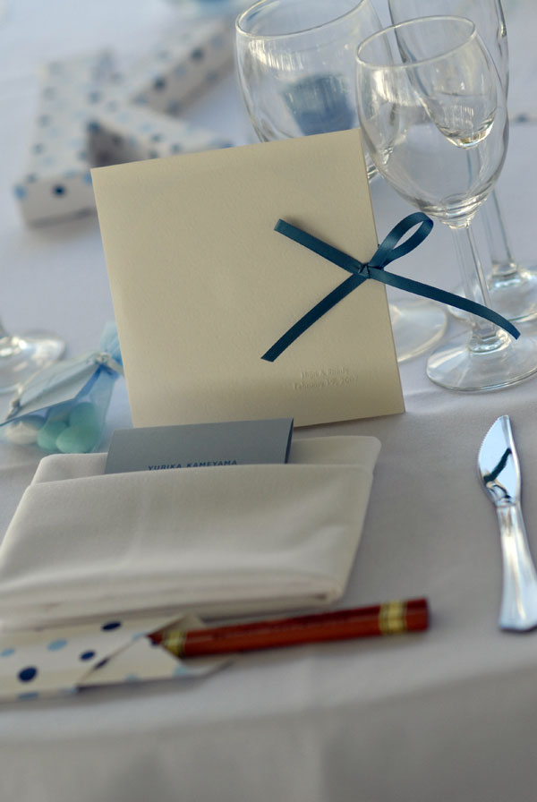
For seating, we named our tables with our initials, my side with polka dots, Randy’s side with stripes, all different patterns and color combination. All the guests got this little vellum envelope with their name and the little cut out letter I made to show which table they were seated at.

and the big letters all wrapped around with each pattern were placed on each table. I bought the letters and wrapped around with the patterned paper I designed and printed.

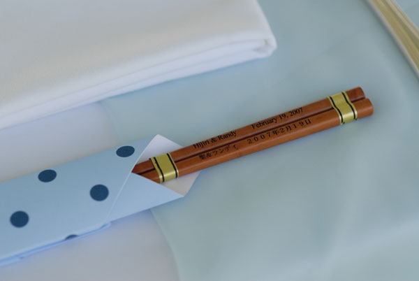
One of our favors – chopsticks; one side in English and one side in Japanese – We folded the chopsticks sleeves for each one to match the table pattern.

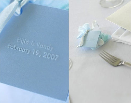
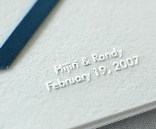
Another favor: Jordan Almonds – we custom made this embosser and we made this little note that was attached to each organza packet. Inside, you can read about the tradition of giving away Jordan Almonds.

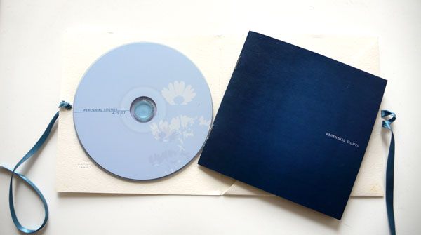
Another favor: CD – since we both love music (we met through music) and lots of the songs we picked for the wedding was one of our favorite genres, Jazz, and so we compiled our favorite Jazz songs into one CD.

The cover was embossed with the embosser.

Inside: CD entitled “Perennial Sounds” and a booklet “Perennial Sights” – noticed the flower design on the CD? Yes, the flowers bloomed on this day! (from the concept) Jazz was perfect for the title and our concept matches with the name completely. We brainstormed together so much and Randy came up with the name!

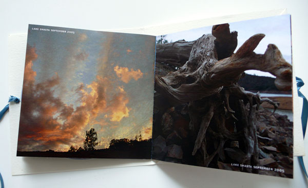
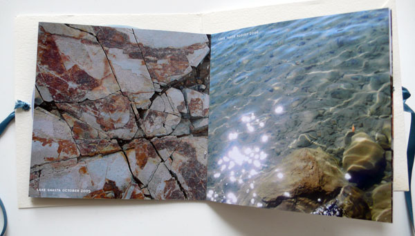
For the booklet, we gathered all the pretty pictures we took together from our travels and just put the name of the place, the month and the year. Hoping these things would never change…


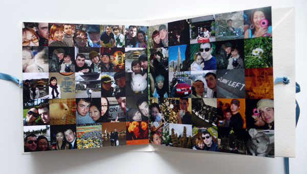
and at the end, we gathered all our happy pictures together.

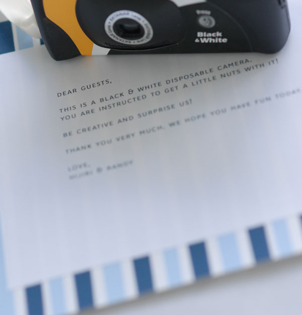
Each table had a black and white disposable camera and I designed this little note with each pattern to match the table.

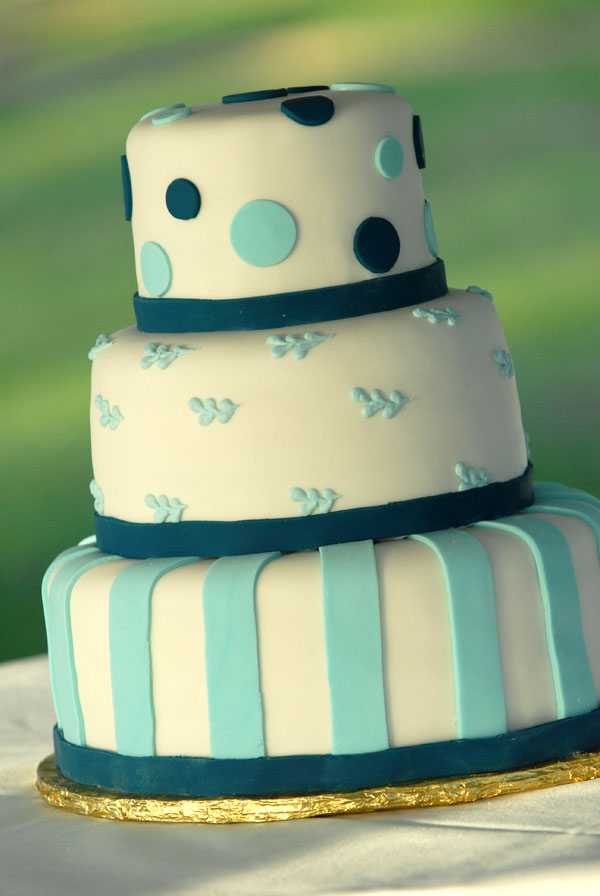
Wedding Cake: Of course we designed it to match everything! It was the cutest cake ever and I actually entered a drawing and won this cake!!! It can be really expensive, but for us, it was free and still custom designed! Thank you!


I hope you enjoyed it! Happy Friday, everyone!

