BKLYN DESIGNS 2010

Hello, another week! Did you have a nice Mother’s day weekend? Are you ready for a new week? :)

I went to BKLYN DESIGNS on Saturday since it was happening right here in my neighborhood — it was great! I found lots of inspirations not only for interior designs and product designs, but also graphic designs + much more. Here are some photos from the show… hope it’ll give you some inspirations this morning… enjoy!

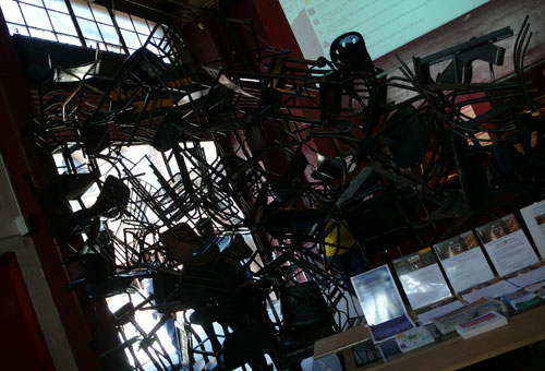
It had me at the entrance: awesome divider with lots of black chairs
Lovely wallpaper pattern from grow house grow:
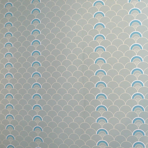
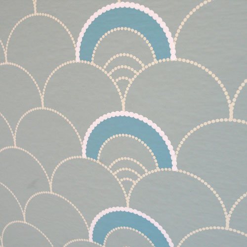
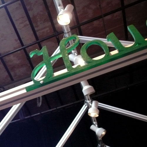
Their logo was on the top of their booth in 3D format. Love.
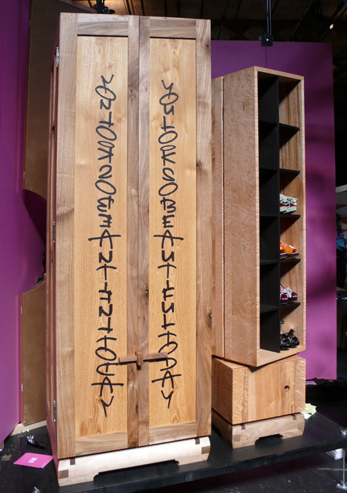
This wardrobe from daniel moyer design with the typography caught my eye. “You look so beautiful today” — a nice piece!
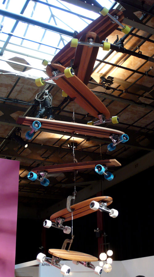
and a cool skateboard mobile:
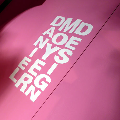
I also loved the logo design. Very cool.
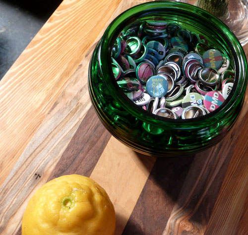
and of course the pin badges. So fun :)
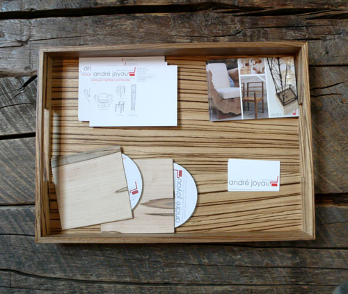
André Joyau booth had a nice collateral design going on — love the wood on wood and their CD/DVD jacket was made with wood and chipboard! Love.
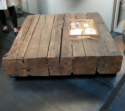
and the stunning coffee table… would love to have that in my new loft, please.
Loved the logo design from THINK*fabricate/Doban Architecture, too. Colorful stickers caught my eye.

and this was one of the most interesting booths of the show for me; Hugh Hayden Design. It looks like a bunch of pretty frames on the wall…
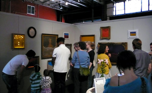
but in each frame, there is an ant farm! A living work of art, FRAMEicarium:
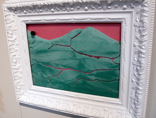
The FRAMEicarium is constantly changing and active” — so very interesting and I’m sure it is beautiful to see…
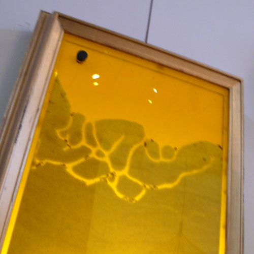
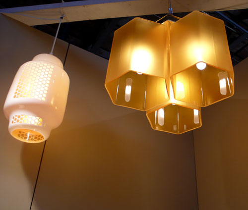
Speaking of nature, I thought these honey comb chandeliers from furthurdesign are cool…
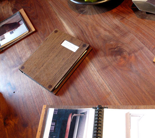
Another beautiful wood on wood presentation — love the wooden portfolio book. via City Joinery.
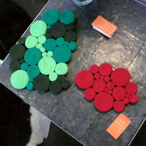
LOVE these coasters/trivets from Lamacek! So cute.
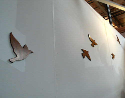
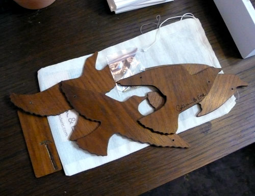
Flock of Birds from Colleen & Eric are made out of North American hardwood veneered panels — reusable! unlike those vinyl wall decals. It’s reversible, too, so you can enjoy darker wood or lighter wood or both. Very cool.
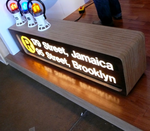
Would love to have this subway signage lamp bench…. (via 718 Made in Brooklyn) Great Helvetica usage in the house, too :)
uhuru‘s Coney Island Line definitely caught my eye.

“The reclaimed wood surface of our console echoes the inlaid pattern of the original boardwalk”
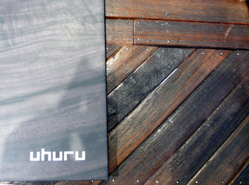
Love the lettering…

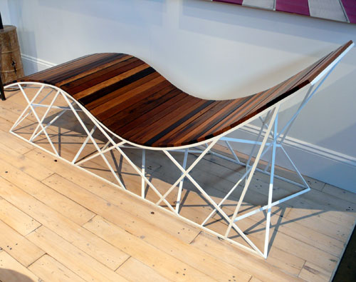
CYCLONE LOUNGER!

These tables are also inspired by Coney Island’s rides and landmarks. So whimsical and so Brooklyn, I love it!

and… couldn’t take any pictures, but if we ever have kids, I’d love to get some furniture from Argington

Thank you BKLYN DESIGNS for all the inspirations!!!
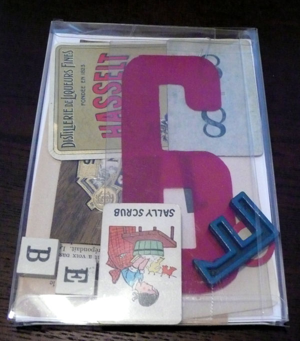
My UPPERCASE Purchases

I mentioned that I ordered something from UPPERCASE the other day, and I got it finally! I waited for so long at the post office, it is the crazy season to be in the post office… but it was worth it.

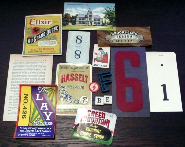
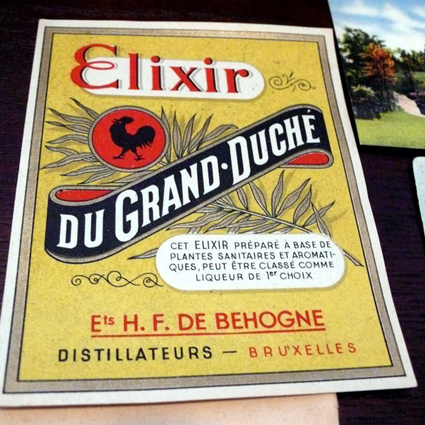
The Eclecto Type Treasures – packs of random goodies from vintage liqueur & food labels to plastic sign letters that they put together, you never know what you will get, but this sounded like exactly what I would love no matter what’s inside so I ordered it and…

Mine is like this:

woooooo I love every single one of them!

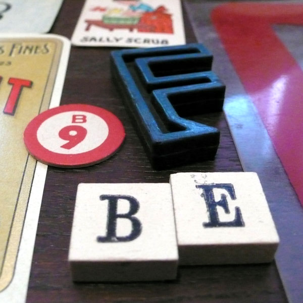
Cool “F” and “B” “E” are cute, too:

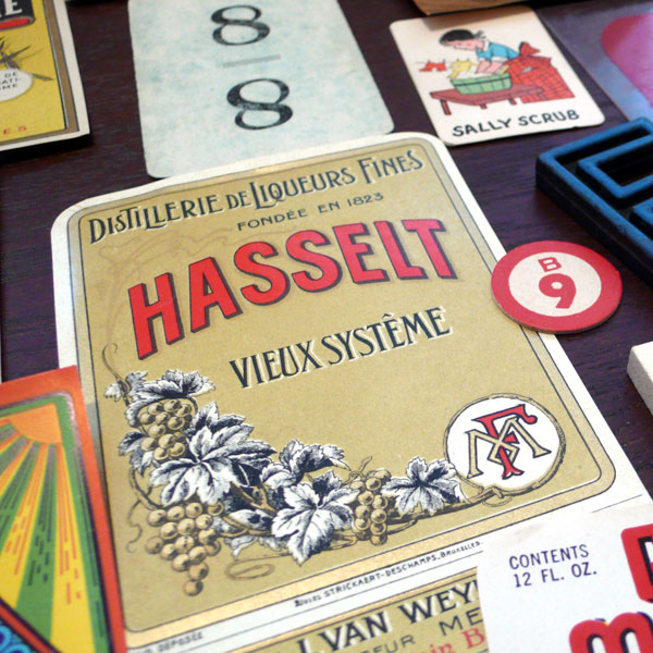
A Vintage liqueur label – very nice.

I love this one – the types are awesome.

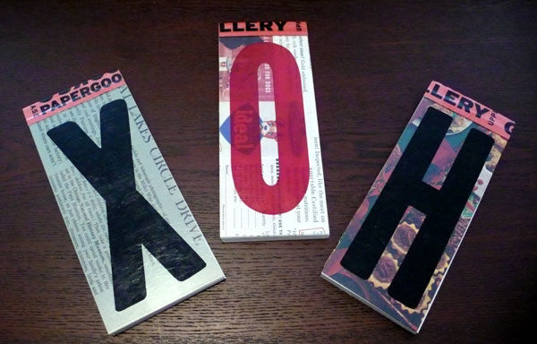
and also, I ordered Eclecto Pad – 3 of them!

I’m keeping “H” one for myself, but I gave “X” and “O” to my husband for Christmas (we did our presents opening already before we do our family’s.) They are so great, perfect for a little notes around your desk!

For Christmas Eve morning inspiration. Happy Holidays, everyone!!!

Typographic Art at Cooper Union

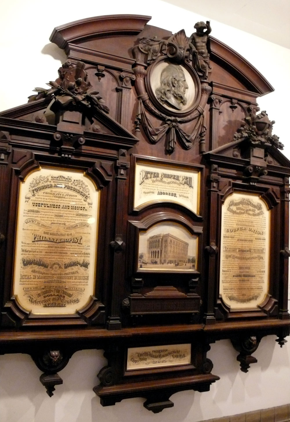
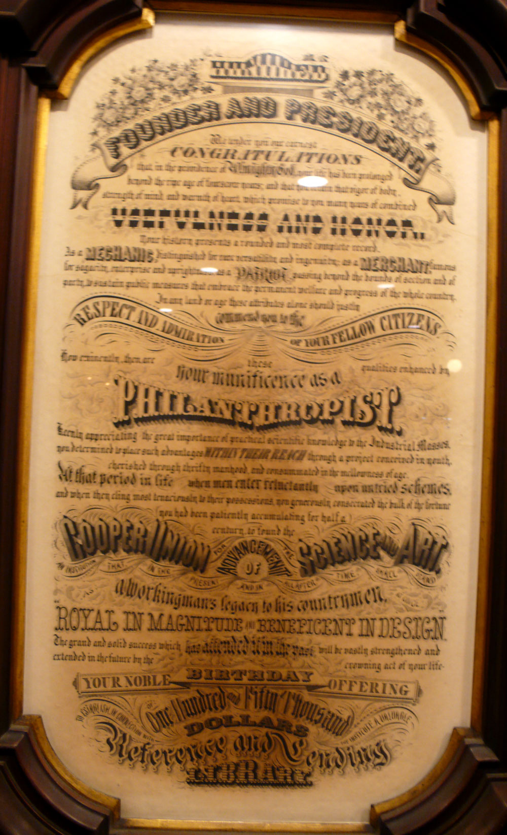
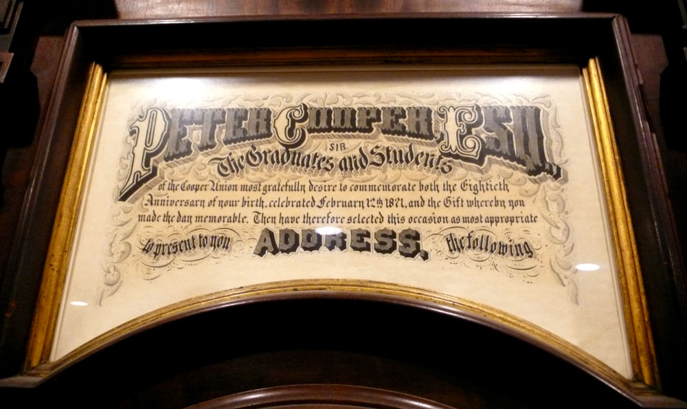
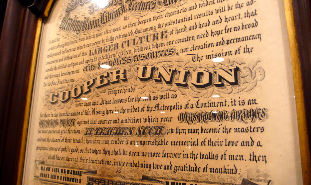
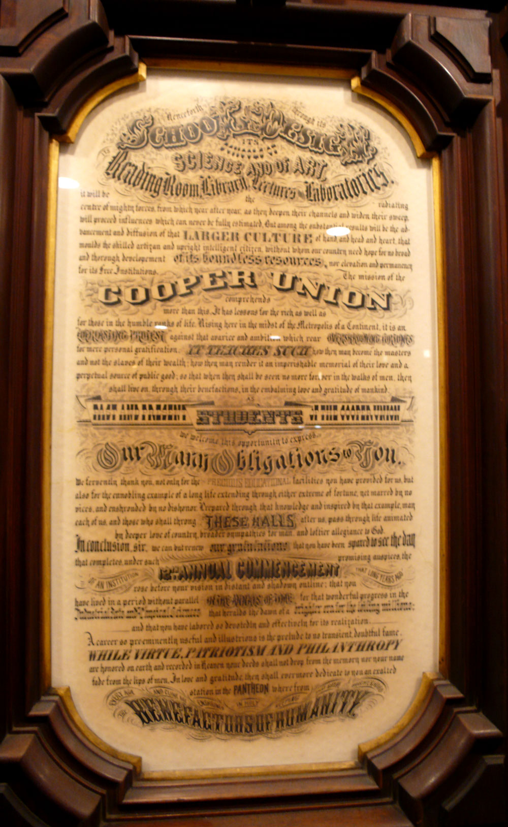
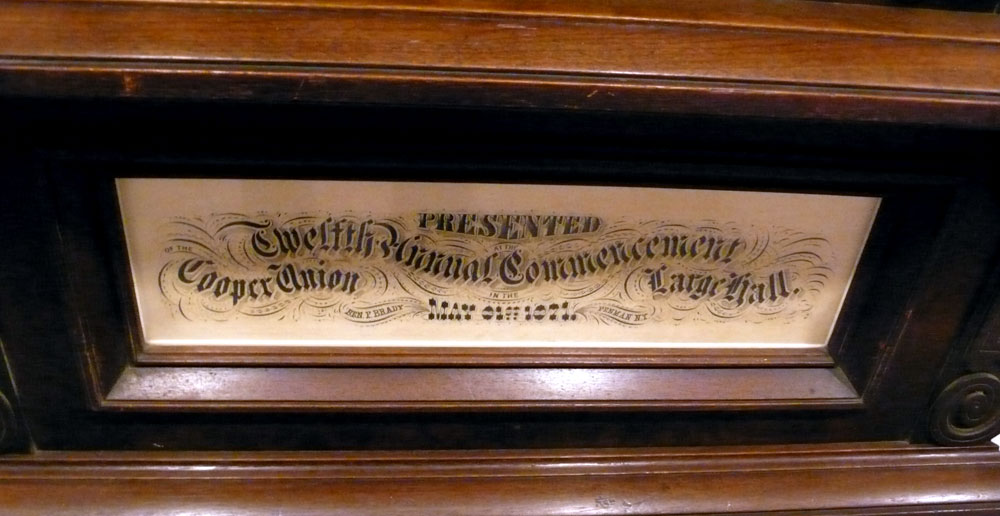
For the last 10 times when I was at the Cooper Union for the letterpress class, I was very fascinated by this typographic art by the entrance in the foundation building. It is stunning! I guess it was a gift to Peter Cooper’s 80th birthday from the class of 1871 (!!) – wow. When you take a close look, it’s even more wonderful because there are so many great use of typography, I’m sure it’s all done by hands, I can stare at this all day.

The 5 art works in the gorgeous frame:

Left side: (sorry for the blurry image… but you still see the great types, right?)

In the middle:

Right side (close up):

Right side (whole):

The curved wood: I love it!

On the bottom – very nice:

More information about this work:

Cooper Union also offers a Calligraphy class, I am actually really interested in the class after seeing this amazing work of art!

—–

I am traveling to Boston today to spend Christmas time with my family-in-law! I’ll be back tomorrow, though, if you are traveling this week, have a safe and fun trip!

Type Mug

I feel like I’ve seen this execution a lot these days, with different words and fonts played around together, nicely laid out together… or does it just keep catching my eye because I am simply drawn to typography?

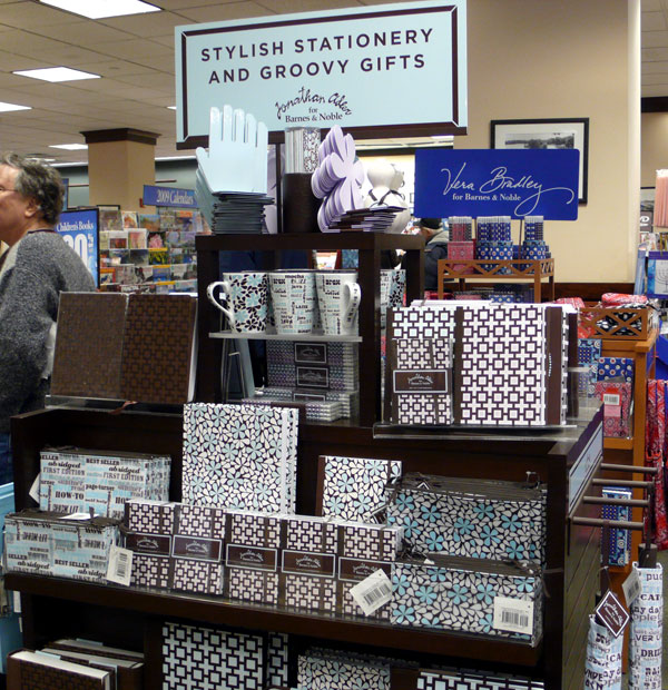
This mug cup I saw at Barnes and Noble is no exception. Love the “CAFFEINE” font.

It’s from the Jonathan Adler collection for the Barnes and Noble – Lots of fun and chic patterns and goods for your office!

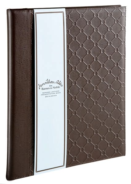
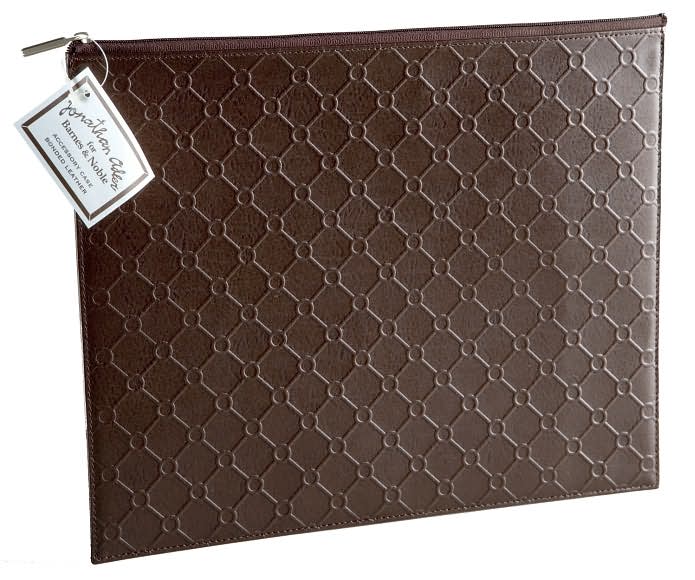
The Leather Presentation Book and Accessory Case I saw at the store are actually really nice. The pattern is embossed and so it has a nice texture and looks very chic.