Silkscreen Reclamation Project Report

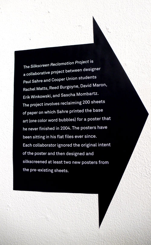
I posted about this cool poster for Silkscreen Reclamation Project before and I stopped by there before my letterpress class last week to see what’s up there – it was so cool! Basically, they all took this piece as a base art (one color word bubbles) and put each creativity on to it, and “reclaimed” it.

I enjoyed seeing the project very much. Here are some work from the exhibition:
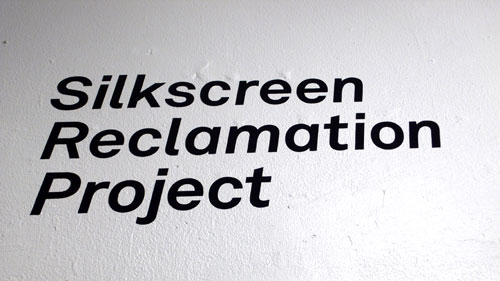
The base art:

Space things always get me.

A bit too hard to read, but I like the decorative typography.

The color combination is cool, funky and fun.

Human vs. Animals? Love the black and white.
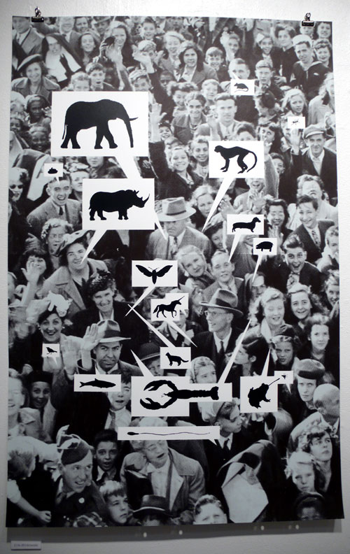
Different asterisk from each typeface. With a little cheat sheet.

Silkscreen Reclamation Project

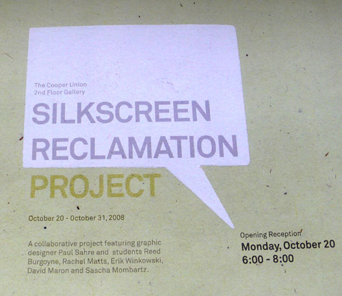
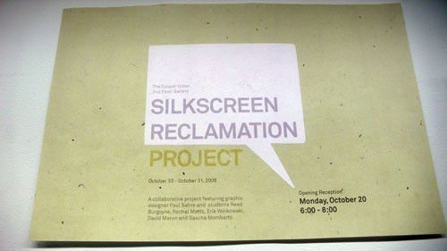
I saw this poster at the Cooper Union. They are having a Silkscreen Reclamation Project show starting today. It sounds pretty cool and I love the poster. Very clean and simple, and the paper they used has a nice texture and caught my eye.

I’m not sure if this is open to public since it is at the school 2nd Floor Gallery, but I will check it out this week when I go to my class and report if I can.

Note: It is open to public!!!

At the Cafe

Just when I was going to put some milk on my coffee, I saw these posters and caught my eye immediately.

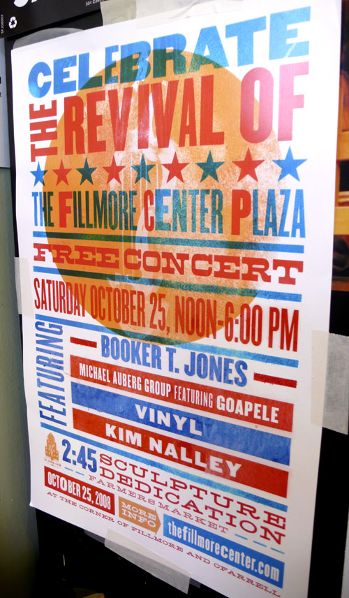
I always love the Hatch Show Print style posters. Very cool. Love it.

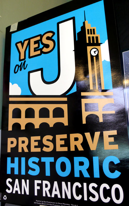
This was bold and simple, I thought it was cool. Yes on J! Please preserve historic San Francisco!

This Poster

This poster I saw at the art school caught my eye.

Found out that it’s done by Tingle Fingers Design & Illustration – I knew it was hand printed.

The colors, the illustration and the hand-lettering fonts are so cool.

I am working at the office in SOHO this week…