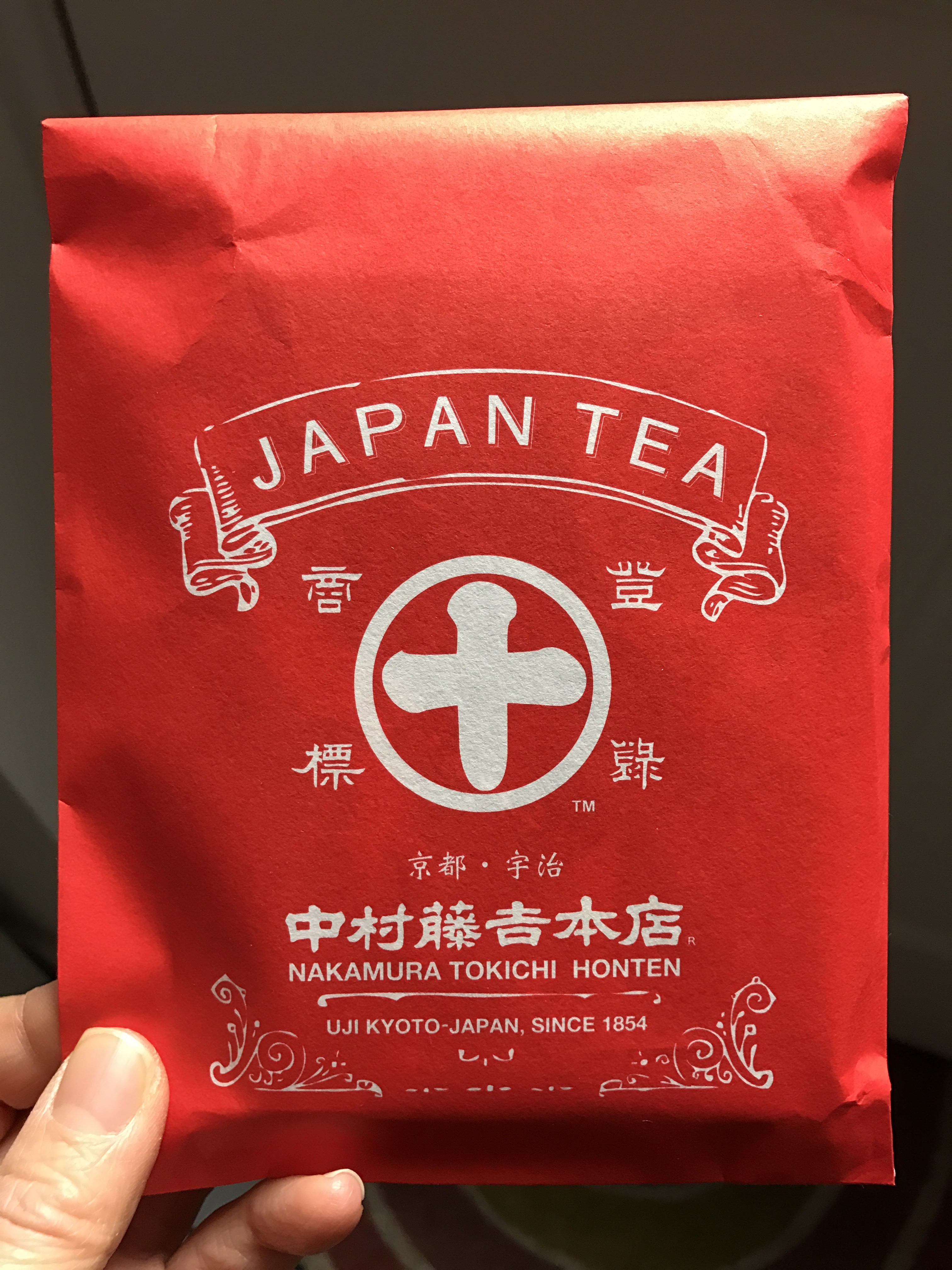
I got this as a gift from Japan, and immediately caught my eye for the cool packaging. It’s a very old traditional Japanese tea company from Kyoto. (There was a macha chocolate inside!)
Happy Friday :)
Let it swim
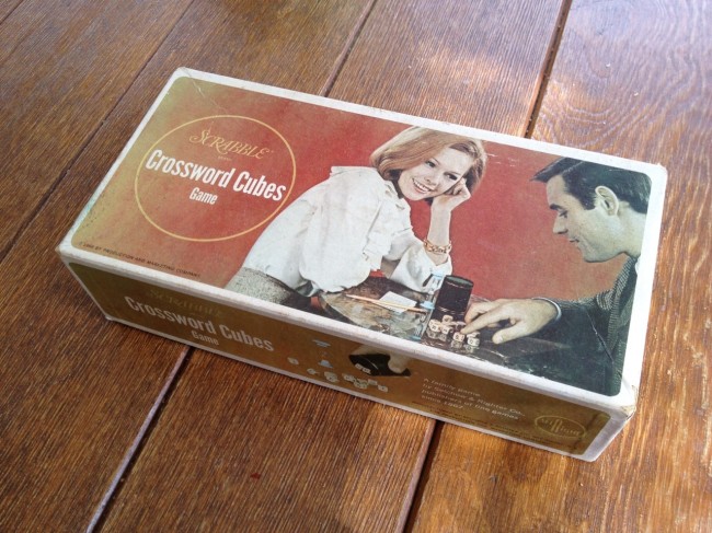
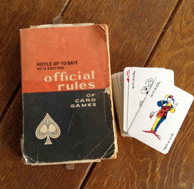
So Randy’s family’s beach house we spent our entire July this year has lots of vintage things in the house. (I’ve blogged about some of them here and here before.) Here are some that have the cool vintage packaging — they’ve been sitting there since the 60’s or so, I love them :)
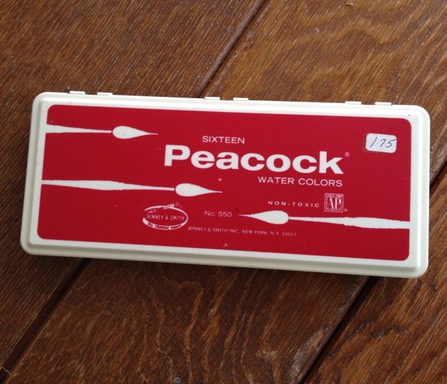
Yes, the water color set was $1.75 back then. I wonder how much this will cost now…
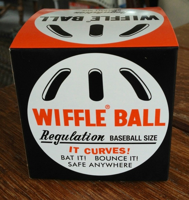
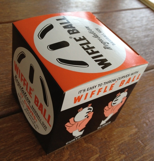
My husband got some wiffle balls to play and I couldn’t help but notice its package design — very classic and cool, don’t you think? Orange and black color combination is striking, too. Yup, having fun at the Cape house :)
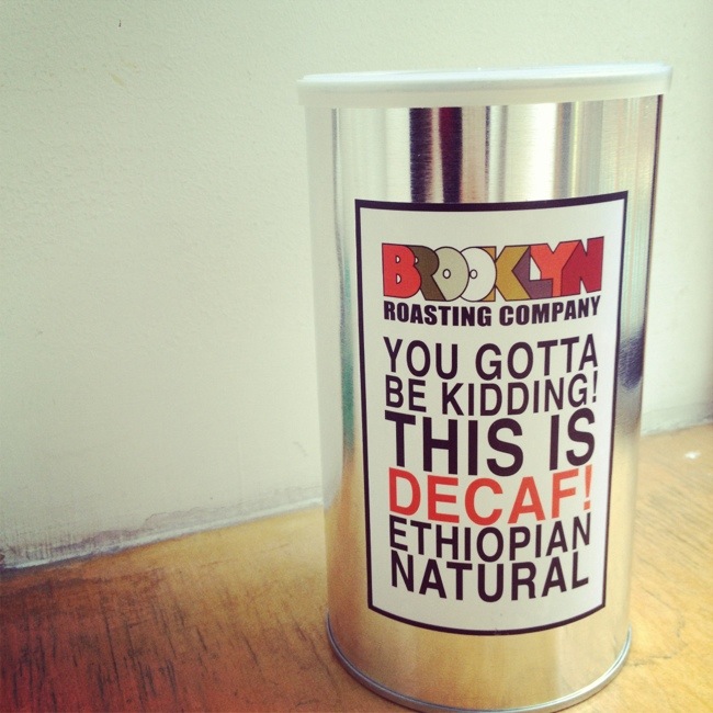
I mentioned a little bit about Brooklyn Roasting Company on Tuesday — I like not only their coffee, but also their packaging. The picture is their decaf coffee packaging. Isn’t that great?! (and they are not kidding. It’s so good.) It also comes in a tin can, which I like. You bring back the tin can, they refill it with the beans and you get a dollar off, too.
All of their coffee packaging is designed just with simple Helvetica!