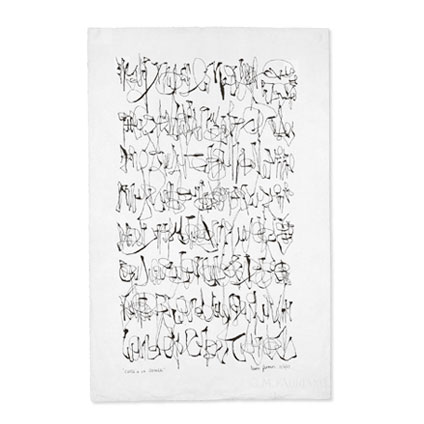
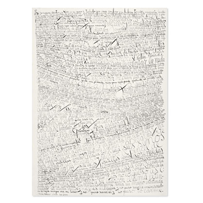
Inspiration: MoMA Visit 1

Last Sunday, I visited MoMA and found lots of inspirations — will have couple more posts later, but here, I wanted to share some typographic inspirations from the walls. Love looking at museum walls besides the exhibition (of course) because it always has cool design and typography.

Bruce Nauman: Days (very interesting exhibition – “sound sculpture”)

A huge wall full of days. Monday through Sunday. Not in exact order. Caught my eye. (and makes sense for the exhibition, too)

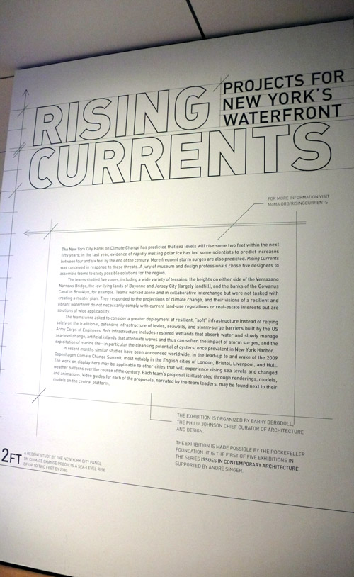
Rising Currents: Projects for New York’s Waterfront (also an interesting exhibition)

I liked the project description wall. Nicely designed.
and this was on the 2nd floor wall — I’m not sure if this is a work in progress or if this is it… I didn’t see any project caption or anything, but either way, it caught my eye.

Met Museum Bag

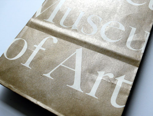
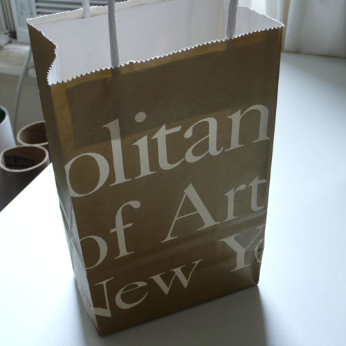
When I was cleaning my office area, I found the Metropolitan Museum of Art shopping bag. Yes, I keep stuff like this… because it caught my eye and I thought it was cool typographic design. The bag is gold and white lettering around — very chic :)

metbag1

metbag2

metbag3

This reminds me to visit there again… maybe soon… very soon…

MoMA | Martin Kippenberger

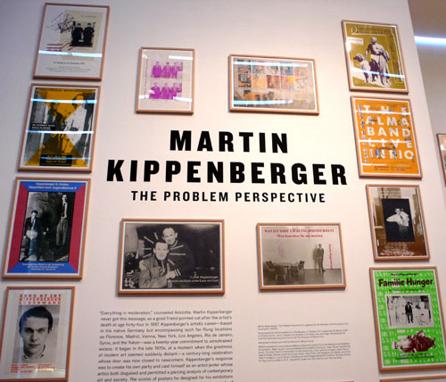
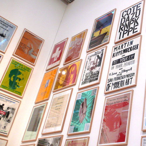
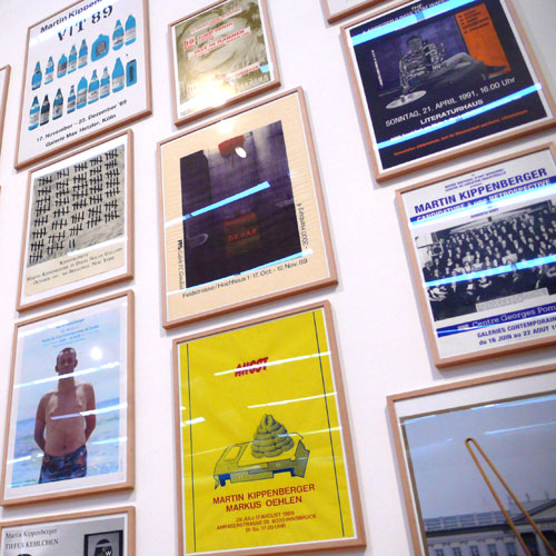
One more post from my MoMA visit… Martin Kippenberger: The Problem Perspective. Just to be in the entrance area of this exhibition made me so excited – walls of great posters he designed for his exhibitions! Each one is so different and unique, my eye was so busy just to take in. I couldn’t take any photos inside the exhibitions, but you will find so many of his works including paintings, sculptures, installations, drawings, prints… lots of stuff. Lots of energy. It was cool.

martinkippenberger

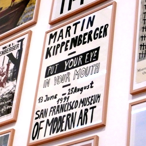
martinkippenberger2

martinkippenberger3

I especially liked this hand-lettering poster for SF MoMA exhibition. Back in 1991.

martinkippenberger4

It is going on until May 11th, if you are around in NYC, you should go check it out!

MoMA | Tangled Alphabets

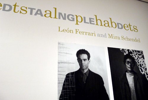
I went to MoMA last week and saw a few exhibitions including this Tangled Alphabets by León Ferrari and Mira Schendel – the title itself was so intriguing to begin with and so I was really looking forward to this exhibition – it was really interesting and cool, it was an art created by letters and hand-writing alphabets! It wasn’t design exhibition, it was a true art.

The exhibition starting area. I like the different fonts and words all played around with each other.

tangled1

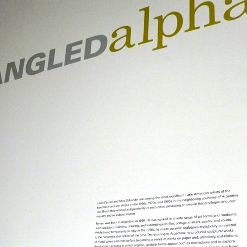
The wall explaining who they are:

tangled2

another shot of the title of the exhibition – it really shows how this exhibition is about.

tangled3

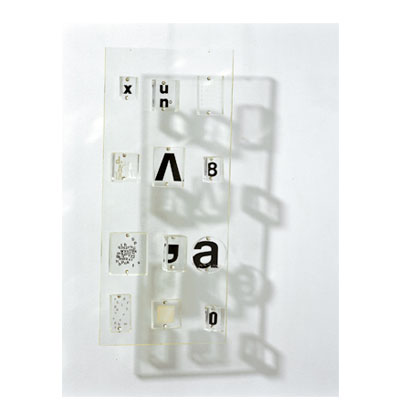
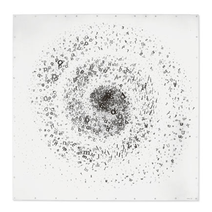
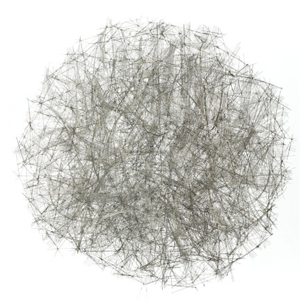
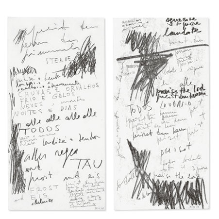
Some images from the exhibition that I liked:

*All the images from here down are from Tangled Alphabets website.

tangled4

tangled5

tangled6

tangled7

tangled8

tangled9

If you are in NY area, I would recommend checking it out, it’s going on until June 15th this year!