Picasso: Themes and Variations

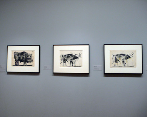
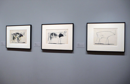
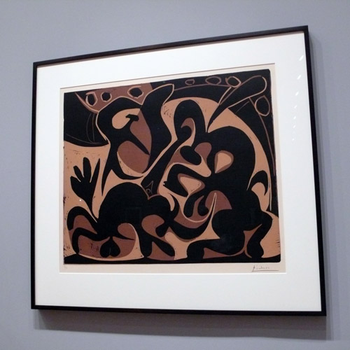
One of the exhibitions I saw at the MoMA last Sunday and thought it was really cool was Picasso’s “Themes and Variations” — it explores Picasso’s creative process through the medium of printmaking. Especially, it was so great to see his linoleum work as I sometimes work with the same medium.

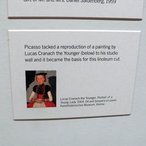
Here is his inspiration:

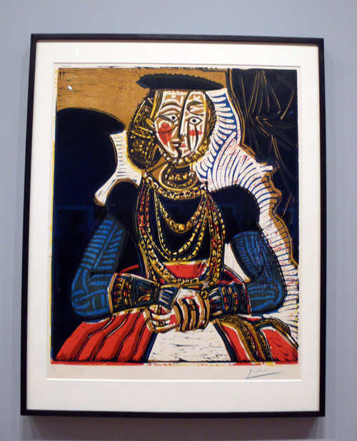
and his work:

“One series of lithographs shows Picasso progressing, step-by-step, from a realistic depiction of a bull to one that is completely abstracted into schematic lines.” — I loved this!

Obviously, there are many more at the exhibition, I enjoyed it very much.

Oh wow, it is JULY!!! Happy July 1st, everyone!!

Inspiration: MoMA Visit 1

Last Sunday, I visited MoMA and found lots of inspirations — will have couple more posts later, but here, I wanted to share some typographic inspirations from the walls. Love looking at museum walls besides the exhibition (of course) because it always has cool design and typography.

Bruce Nauman: Days (very interesting exhibition – “sound sculpture”)

A huge wall full of days. Monday through Sunday. Not in exact order. Caught my eye. (and makes sense for the exhibition, too)

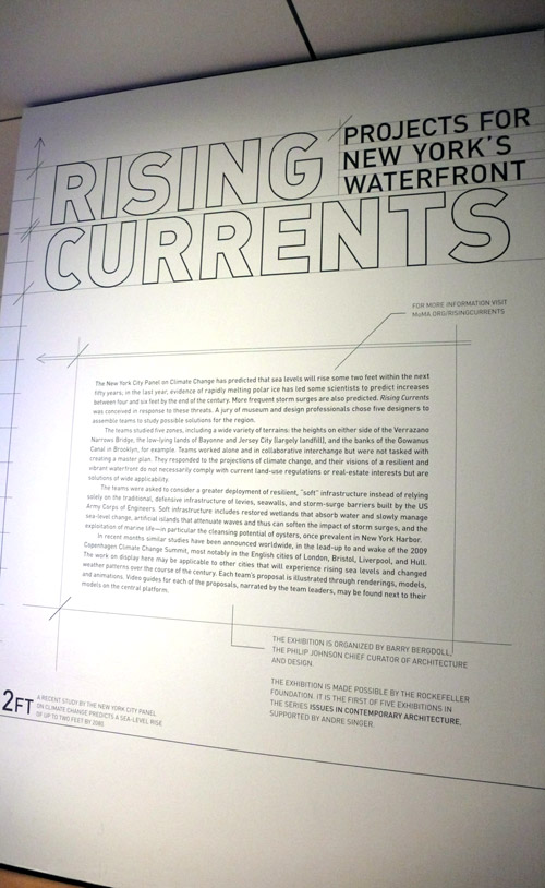
Rising Currents: Projects for New York’s Waterfront (also an interesting exhibition)

I liked the project description wall. Nicely designed.

and this was on the 2nd floor wall — I’m not sure if this is a work in progress or if this is it… I didn’t see any project caption or anything, but either way, it caught my eye.

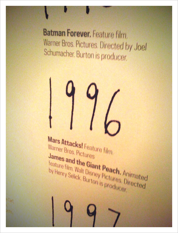
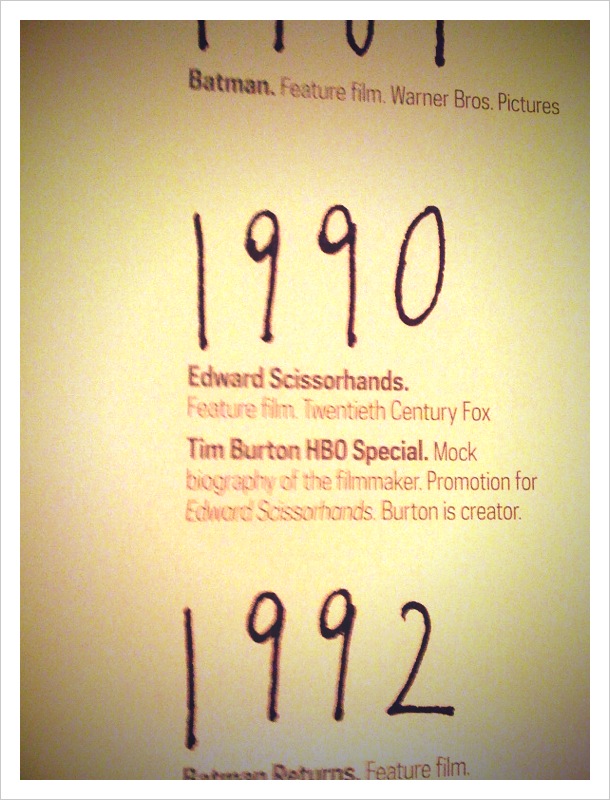
Tim Burton Exhibition

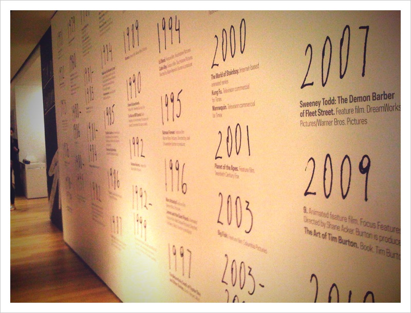
Tim Burton Exhibition is ending today at the MoMA (hurry if you are in NY and haven’t seen this exhibition!), I was so happy to be able to catch it last Friday. I think it must have been the most popular museum exhibition ever just from what I have seen. Every time I went over there, it was packed with people, the tickets were always sold out, and the last Friday was no exception, it was actually the most packed museum exhibition I’ve ever been to. (I became a member finally! I don’t know what I was waiting for…) but it was all worth it. The man is clearly so freaking talented! His vision is oh, so unique and so amazing, no one can see/create his world the way he sees/creates. I enjoyed it so much. Just like I enjoy all his movies. The exhibition covered lots of stuff from hand-written notes of Tim Burton to the movie props, the paintings/drawings to the actions figures… and much more!

Pictures are from Tim Burton Chronology wall before you go into the exhibition. (It was strictly no photography allowed inside.)

*****************

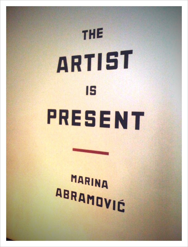
and this is an interesting exhibition that is happening at the MoMA right now, called “The Artist is Present” by Marina Abramović. (Until May 31.)

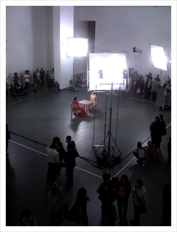
“the exhibition includes the first live re-performances of Abramović’s works by other people ever to be undertaken in a museum setting. In addition, a new, original work performed by Abramović will mark the longest duration of time that she has performed a single solo piece. All performances, one of which involves viewer participation, will take place throughout the entire duration of the exhibition, starting before the Museum opens each day and continuing until after it closes, to allow visitors to experience the timelessness of the works.” — How intriguing!
and here they are. Sitting in the middle of the exhibition room and just staring at each other. The lady in red is Maria. Was really interesting.
Hope you had a nice weekend! :)

**Read and find out more about Marina Abramović here.
Exhibition: Paul Sietsema

A while ago, when I went to MoMA, I saw this great exhibition of Paul Sietsema. I just found some photos sitting on my desktop waiting to be posted so I am finally getting around to it… but I was blown away with his amazing work.

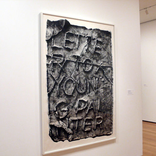
Always love typography on museum wall. I wanna paint my wall with types, too…

so when you look at this, you think he made this art by using the newspaper… but this newspaper, one letter by one letter, was drawn by Paul! I couldn’t believe it.

*Tried to take a close-up picture so you can see the letters are all drawn in, but it is a bit blurry… oops. but it is definitely done by hand. Great lettering.

I also love the neon pink paint can stain or some sort.

and yes, this is a drawing, too. Amazing.

More about the exhibition here.

oh and we tried to go into Tim Burton’s exhibition, but it was sold out for the day. Yes, they are limiting the numbers of people. Next time for sure. Saw this giant sculpture of his, though :)

and I loved the Alice in Wonderland! Have you seen it yet? :)