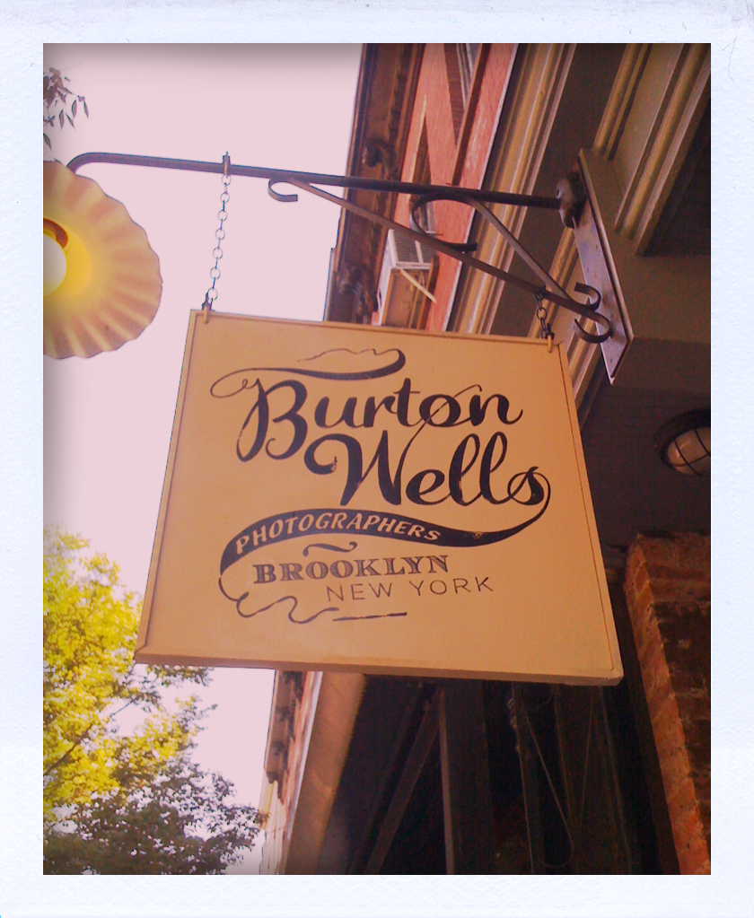
Caught my eye when I was walking down on Atlantic Avenue. Nice script, nice logo and nice store signage. Burton Wells.com
Let it swim
Caught my eye when I was walking down on Atlantic Avenue. Nice script, nice logo and nice store signage. Burton Wells.com

Hello, another week! Did you have a nice Mother’s day weekend? Are you ready for a new week? :)
I went to BKLYN DESIGNS on Saturday since it was happening right here in my neighborhood — it was great! I found lots of inspirations not only for interior designs and product designs, but also graphic designs + much more. Here are some photos from the show… hope it’ll give you some inspirations this morning… enjoy!
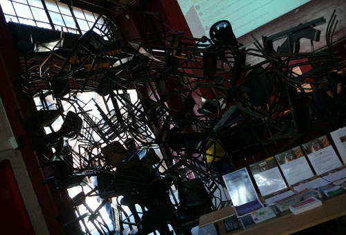
It had me at the entrance: awesome divider with lots of black chairs
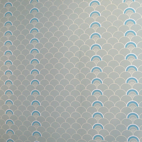
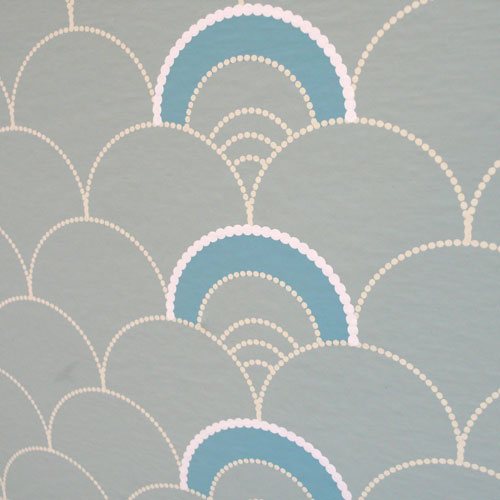
Lovely wallpaper pattern from grow house grow:
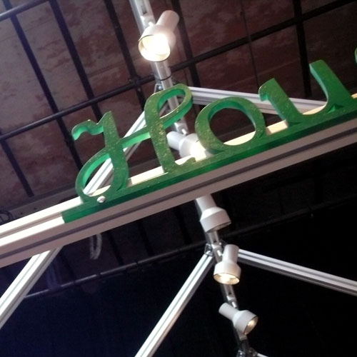
Their logo was on the top of their booth in 3D format. Love.
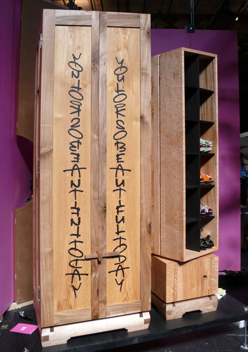
This wardrobe from daniel moyer design with the typography caught my eye. “You look so beautiful today” — a nice piece!
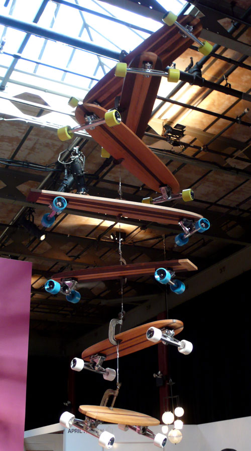
and a cool skateboard mobile:
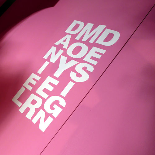
I also loved the logo design. Very cool.
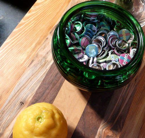
and of course the pin badges. So fun :)
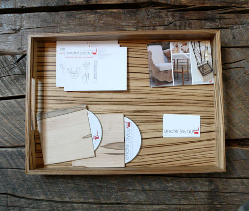
André Joyau booth had a nice collateral design going on — love the wood on wood and their CD/DVD jacket was made with wood and chipboard! Love.
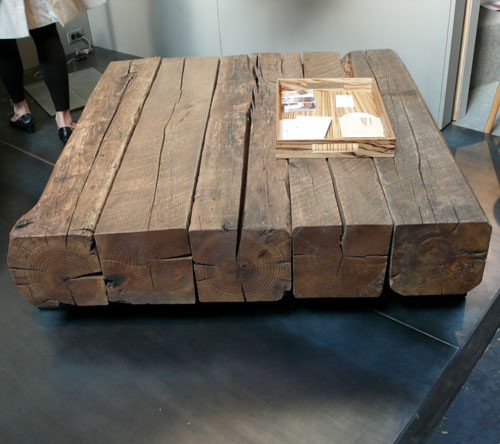
and the stunning coffee table… would love to have that in my new loft, please.
Loved the logo design from THINK*fabricate/Doban Architecture, too. Colorful stickers caught my eye.

and this was one of the most interesting booths of the show for me; Hugh Hayden Design. It looks like a bunch of pretty frames on the wall…
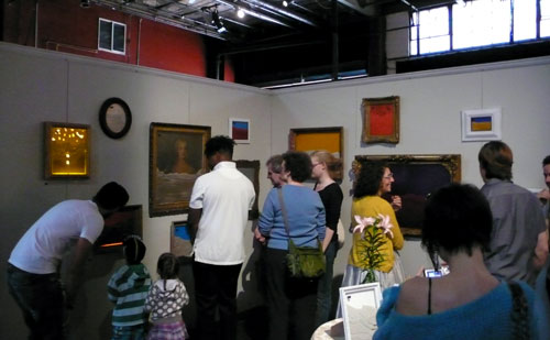
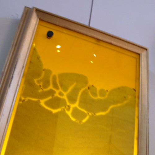
but in each frame, there is an ant farm! A living work of art, FRAMEicarium:
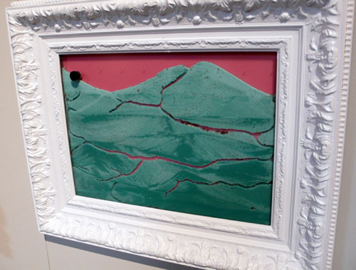
“The FRAMEicarium is constantly changing and active” — so very interesting and I’m sure it is beautiful to see…
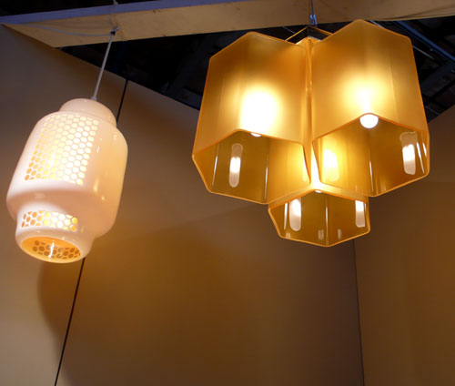
Speaking of nature, I thought these honey comb chandeliers from furthurdesign are cool…
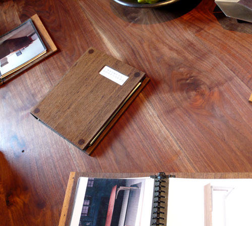
Another beautiful wood on wood presentation — love the wooden portfolio book. via City Joinery.
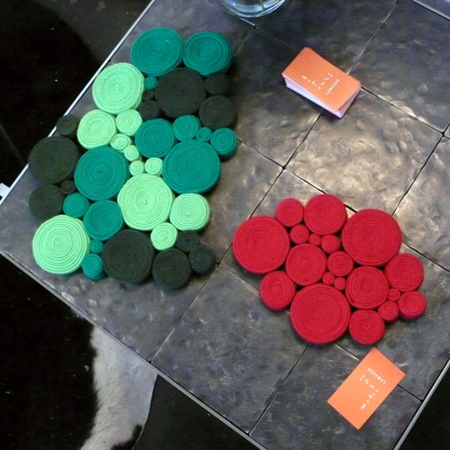
LOVE these coasters/trivets from Lamacek! So cute.
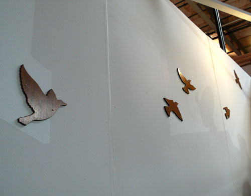
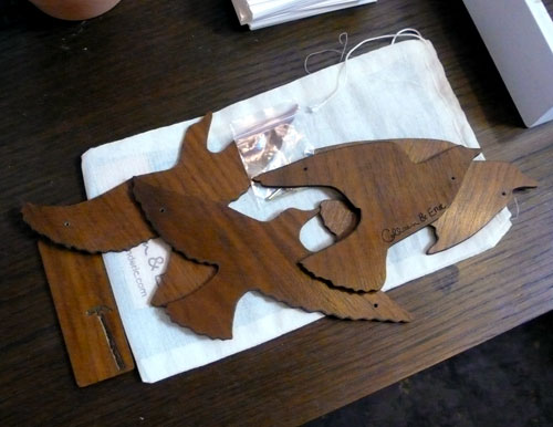
Flock of Birds from Colleen & Eric are made out of North American hardwood veneered panels — reusable! unlike those vinyl wall decals. It’s reversible, too, so you can enjoy darker wood or lighter wood or both. Very cool.
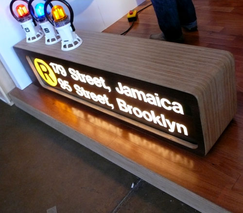
Would love to have this subway signage lamp bench…. (via 718 Made in Brooklyn) Great Helvetica usage in the house, too :)
uhuru‘s Coney Island Line definitely caught my eye.
“The reclaimed wood surface of our console echoes the inlaid pattern of the original boardwalk”
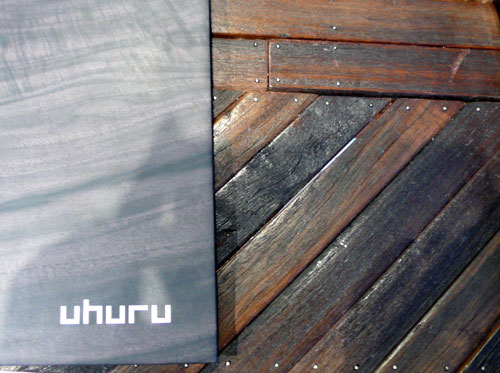 Love the lettering…

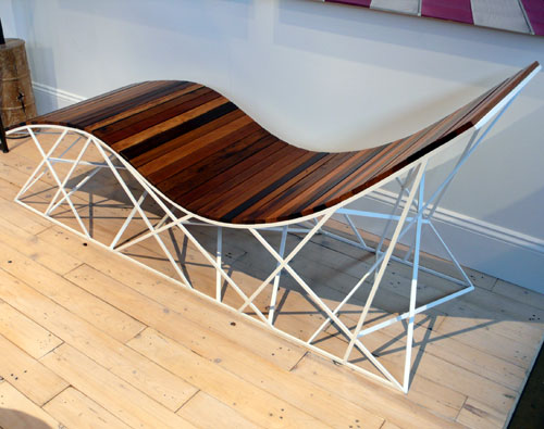
These tables are also inspired by Coney Island’s rides and landmarks. So whimsical and so Brooklyn, I love it!

and… couldn’t take any pictures, but if we ever have kids, I’d love to get some furniture from Argington…
Thank you BKLYN DESIGNS for all the inspirations!!!
Yes… it has been 8 years… today is September 11th… my thoughts are with NYC and everyone in the world who was affected by the horrible incident…
I saw this post over at Brand New, I had to share it here.
“Originally, in 2006, it was called the World Trade Center Memorial Foundation, then in 2007 it evolved into the lengthier National September 11 Memorial & Museum at the World Trade Center. Now, eight years after the events of 2001, the name has changed to the simpler and more colloquial 9/11 Memorial.”
Designed by Landor in New York, I thought the new logo is very clever, simple, clean and strong. (That’s what I like the most about logo designs)

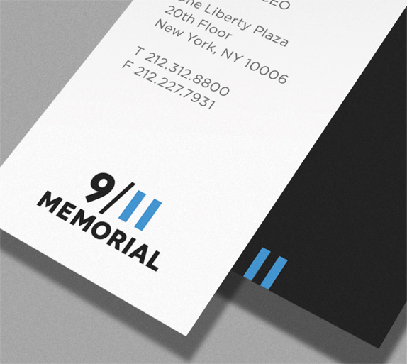
You can read more about it here.
At Fenway park, I saw a wall of Budweiser logo history gallery. From way back in 1936 to 1996… I was surprised to see some of the logo design they had.
1936: I guess this was the first Budweiser logo. Very classic.
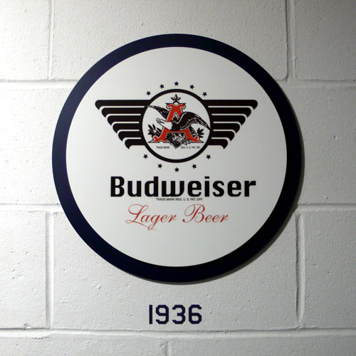
1947: They added lots of lines… it looks like an ad or something.
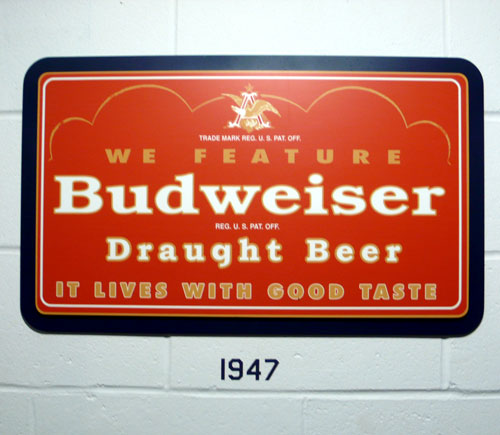
1948: Went back to simple execution. I like this one.
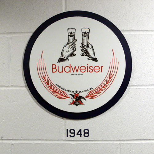
1952: Different interesting shape…
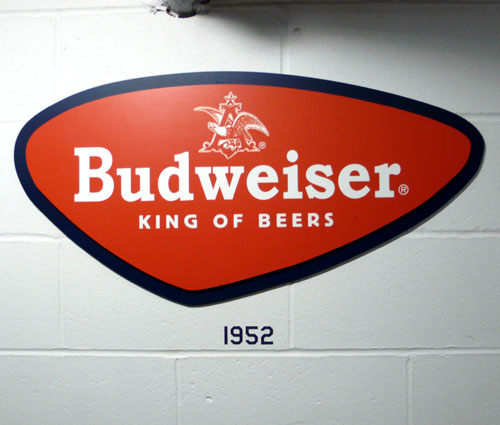
1955: How fun. I love the shapes, very retro.
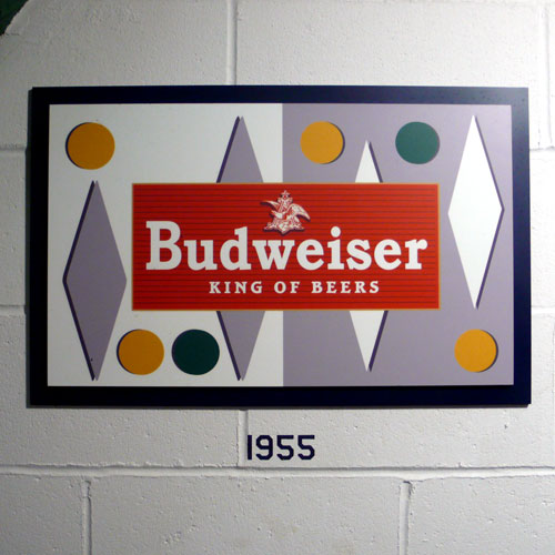
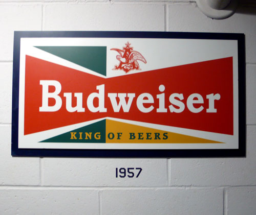
1957: Similar from the previous one, played with shapes… it looks a bit unbalance to me…?
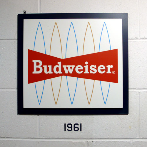
1961: This one is very retro, too. I like the line shape on the background.
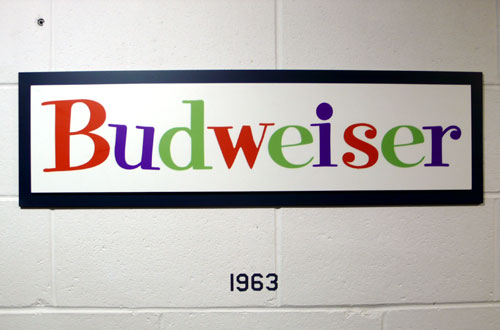
1963: this one surprises me… it doesn’t look like Budweiser / beer logo at all. Looks fun, though.
((and there was a beer booth in between here….!))
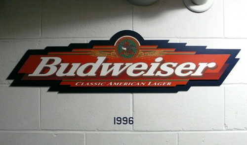
1996: I remember this one. I’m not sure what happened in between 1963 to 1996…
Thursday morning inspiration. Have a great day!