H is for Hello!

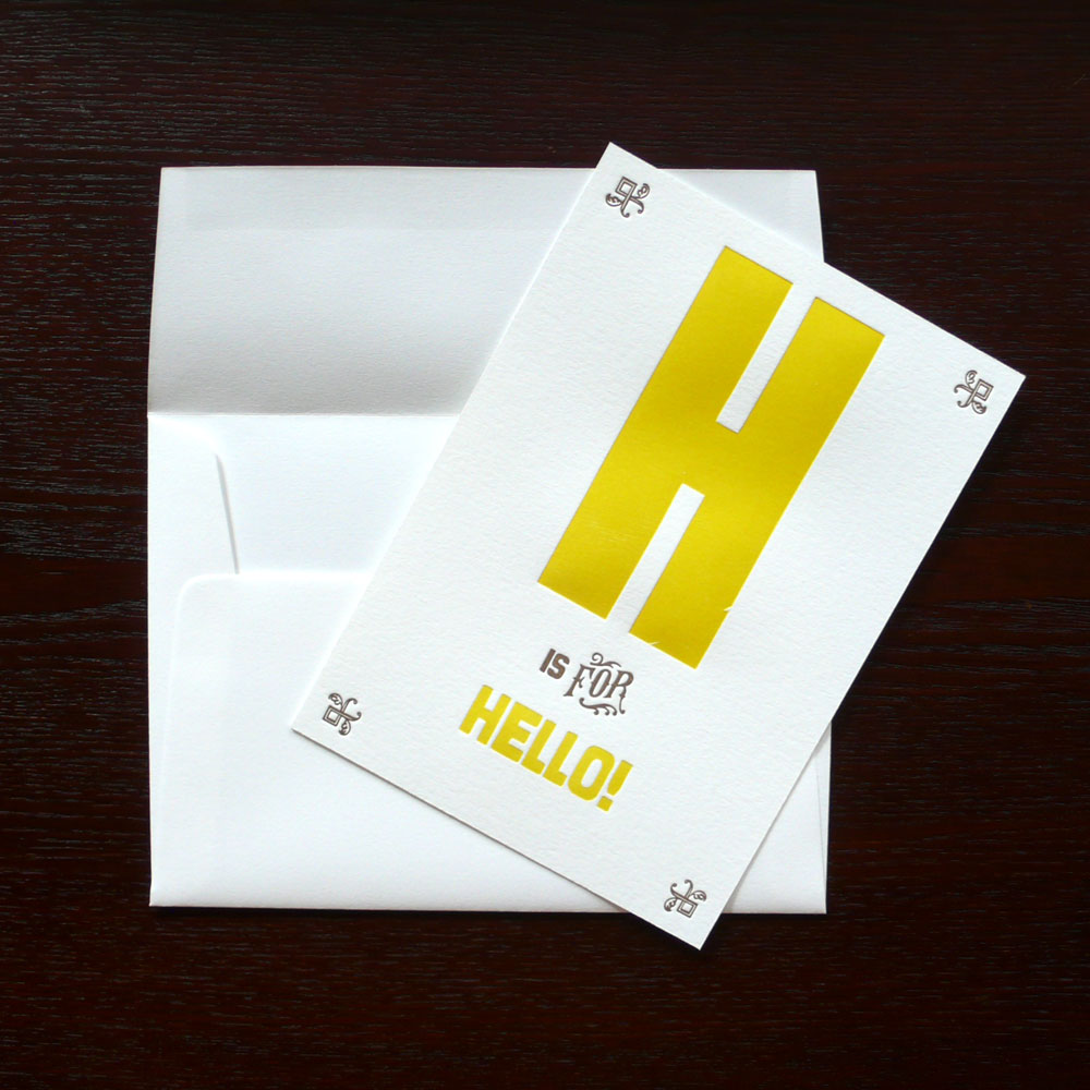
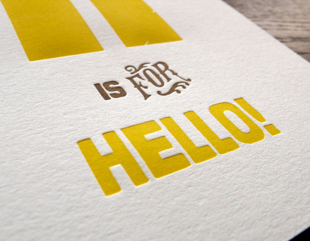
A new addition to my alphabet greeting cardsH is for Hello!

I am printing more, hope to have A to Z as Stephanie has asked… :)

I already printed wood type H and Hello! in yellow a while ago, I just had to print the second color brown… setting the plates on the base:

hisforhello1

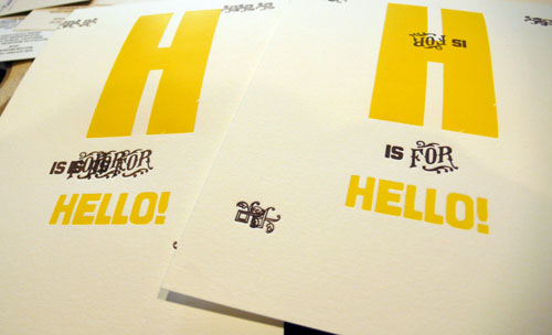
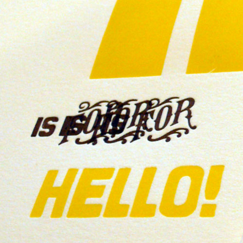
Adjustment to do. and yes, to get to the perfect position, there would be mess-ups.

hisforhello2

They never get to go anywhere so I am sharing them here… :) Sometimes it creates an awesome art!

hisforhello3

and here is the final product. Comes with matching 100% cotton envelope.

hello1

hello4

Available here!

Hello Tuesday… please be nice to me…

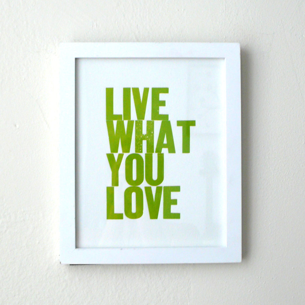
Live What You Love 7th Edition

I can’t believe it’s my 7th edition now… thank you so much for all your support! I printed a lot more this time with lots of new summer inspired colors, I am so proud of each one.

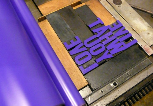
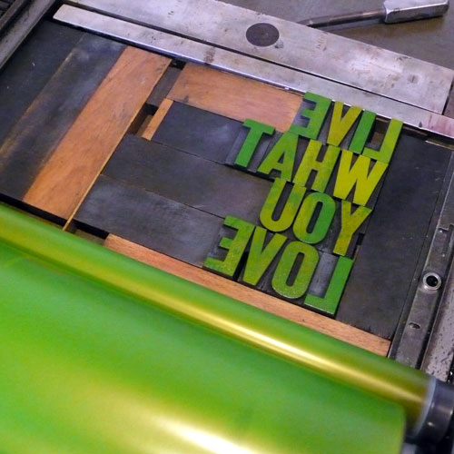
Here we go…. type setting.

lwyl7_1

Adjust the placement and impression. This time, I made a little stronger impression :)
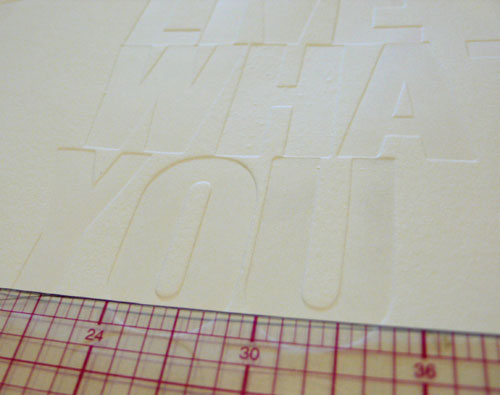
lwyl7_2

I always start with yellow. It’s easy to go to next one (always orange) without having the press clean so much. Yellow one is the most popular one, too. (The yellow poster/print was featured at Apartment Therapy! Thank you so much!)
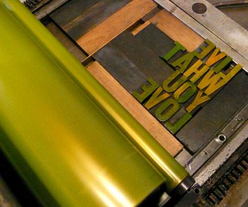
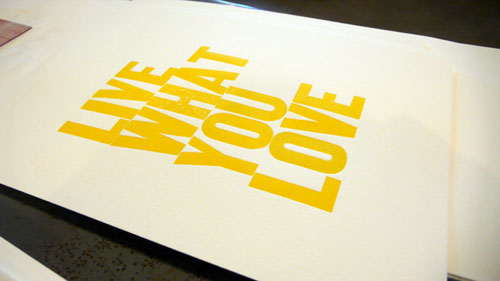
lwyl7_3

lwyl7_4

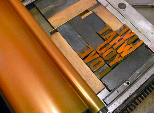
Mixing orange. This time, the orange is more summery fresh sunkist orange! I quite like the freshness. Check it out here.
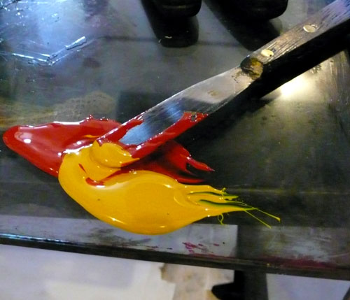
lwyl7_5

lwyl7_6

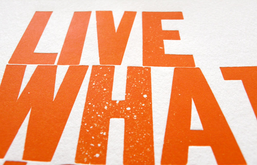
*”H” has lots of textures!

orange4

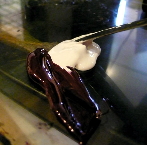
Mixing hot pink… 6th edition was so popular that I had to print more this time.
lwyl7_7

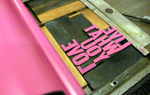
I always love the pink press. So cute. Hot pink one is available here.
lwyl7_8

*and “U” has a dotted line… :)

pink4

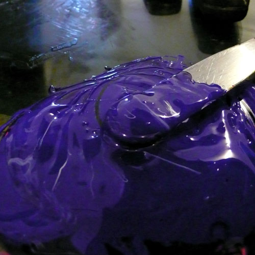
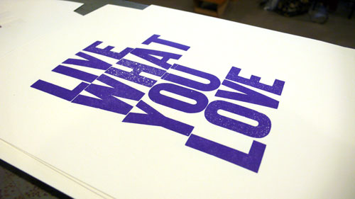
and… I thought maybe purple this time… started mixing pretty purple…
lwyl7_9

On the press. Looks good :)

lwyl7_10

printing away… limited edition of 40.
lwyl7_11

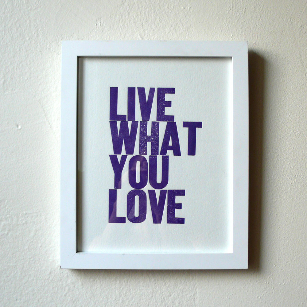
and here it is. Available here.

purple1

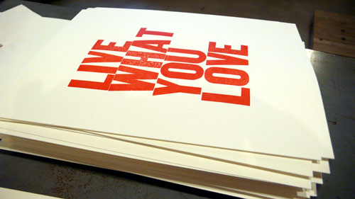
The classic red. It’s actually redder than ever. I wanted to make sure it’s solid pretty red.
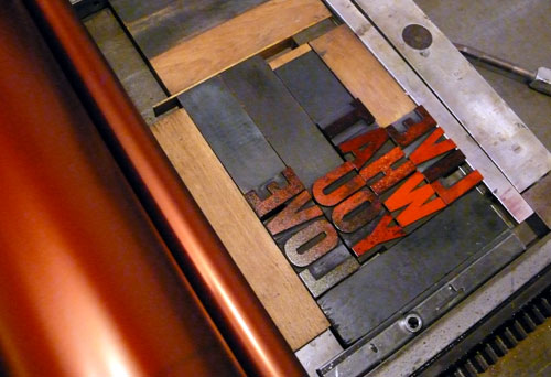
lwyl7_12

Available here.

lwyl7_13

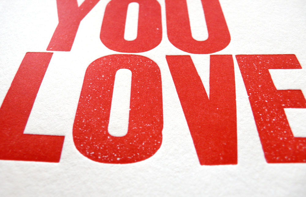
Nice texture throughout.

red3

——————————–

((day 2))

Started with gray ones. I guess I didn’t take pictures! Click here for the gray ones. This time, it’s a little more warmer gray.

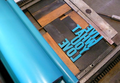
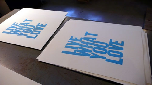
Printing the light blue. The 6th edition sky blue looks a little tiny bit different so I decided to call it differently. This is why I keep editions because I could never print them in the same way! Even within the same edition, each print is different :)
lwyl7_14

lwyl7_16

Light Blue:

lightblue1

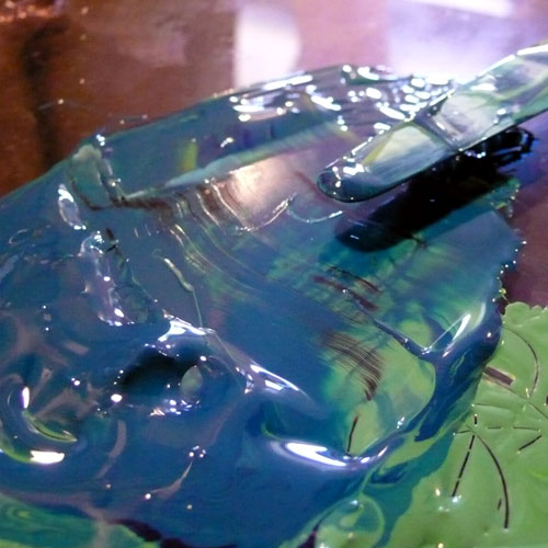
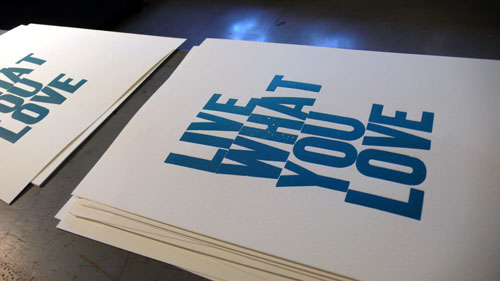
and inspired by summer, ocean, water… I wanted to print something different so I started to mix the colors together… and ended up liking this deep blue-green, printed limited edition of 50. Please grab them if you like it :)
lwyl7_15

lwyl7_17

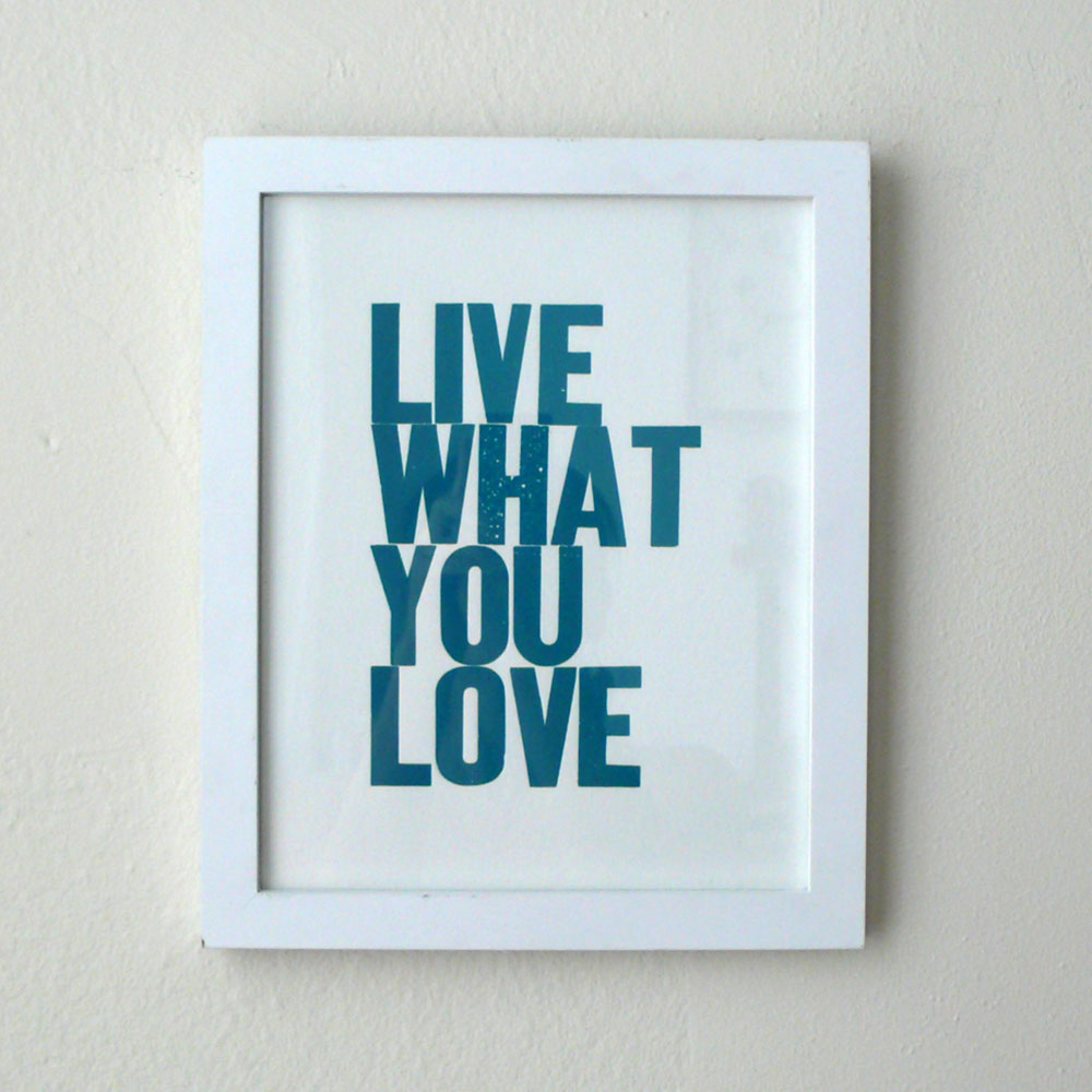
Deep Blue Green:

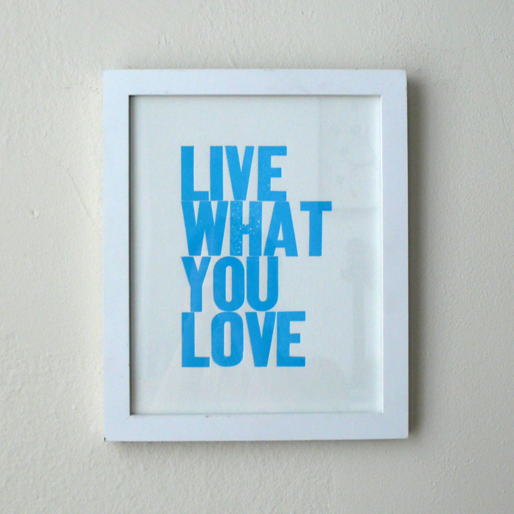
deepblue-green1

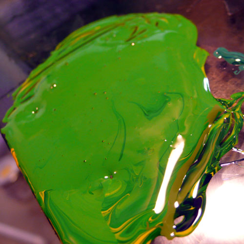
and this is also new… yellow green!

Mixing, mixing…
lwyl7_18

I love this color. Very lively.

lwyl7_19

Yellow Green:

yellowgreen1

I also printed black ones, there are a little bit more black left from the 6th edition so I didn’t post pictures here, but it’s available!

Which color is your favorite?! :) Hope your week will be filled with what you love.
Thanks!

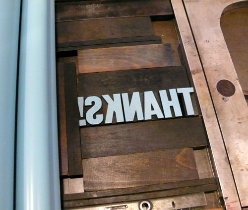
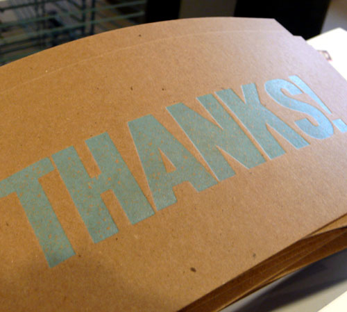
I printed this “Thanks!” card a while ago to include with my orders and I just want to take my time here to thank everyone who’s been a great support and a great customer — I have sold more than 1000 items at my esty shop now! Thank you so much!

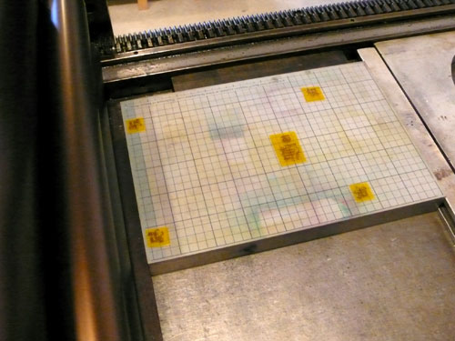
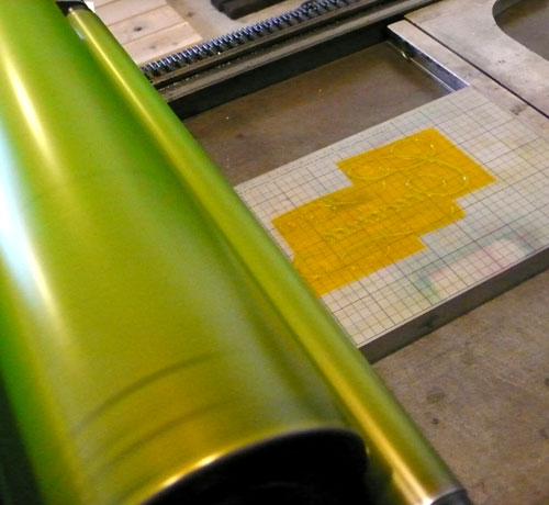
Type setting wood types:

thanks1

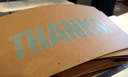
I love the light blue on chipboads!! These cards are all gone now, though, I wanted to archive them here.
thanks2

I will be printing new ones to include with my orders soon… My Hello cards are all gone now, too, so…

thanks3

Thank you again so much!
Have a great weekend!!

New: Cucina Mini Letterpress Print

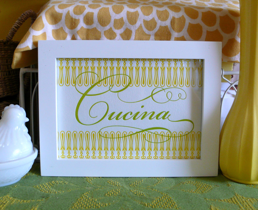
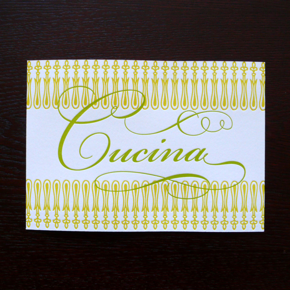
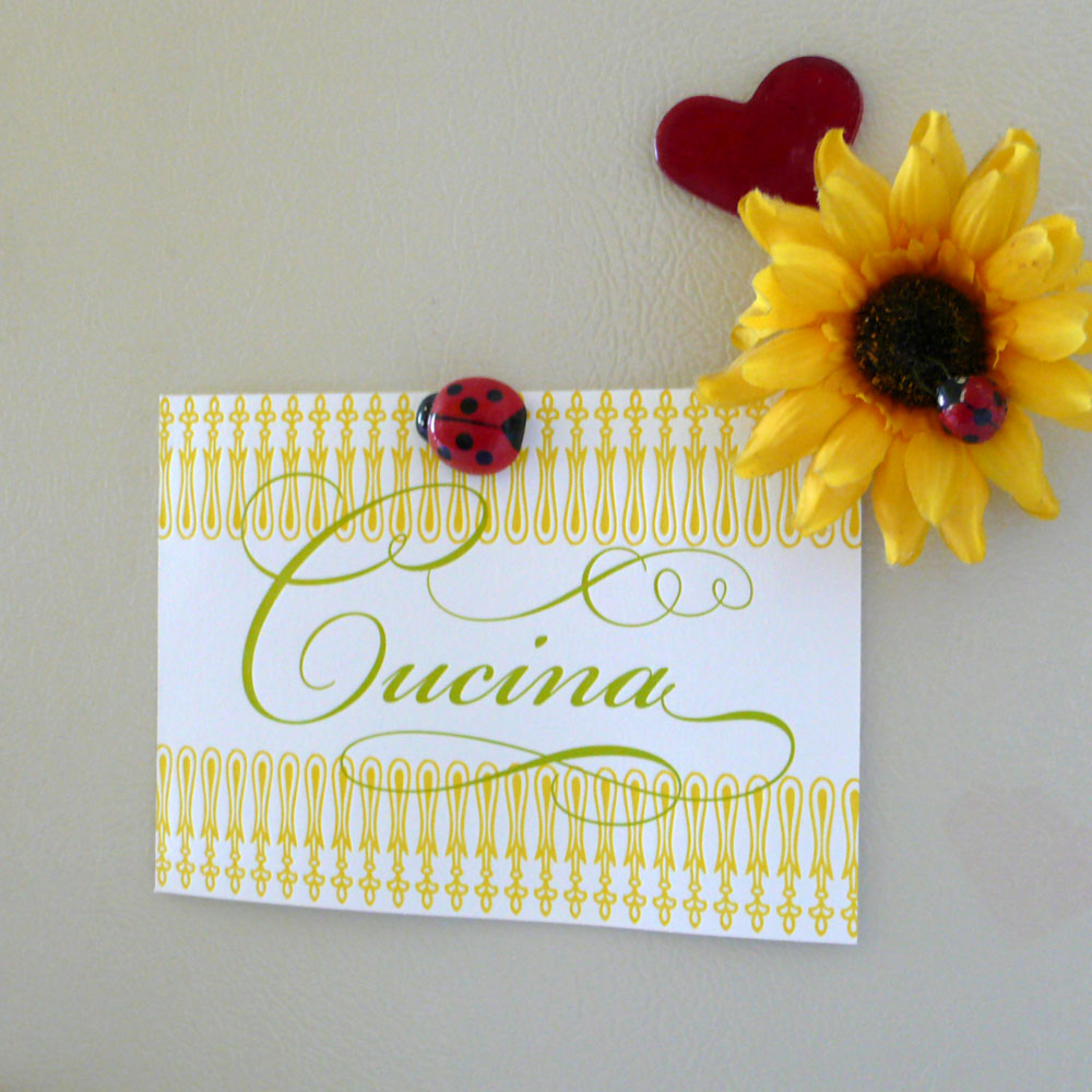
Do you have art in your kitchen? I have a few and I have been wanted to print something just for the kitchen because having an art in the kitchen makes it fun and special. So why not something that says “kitchen”… so here it goes, my new mini “Cucina” letterpress print (cucina = kitchen). I hope you like it :)
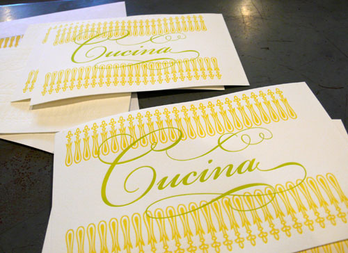
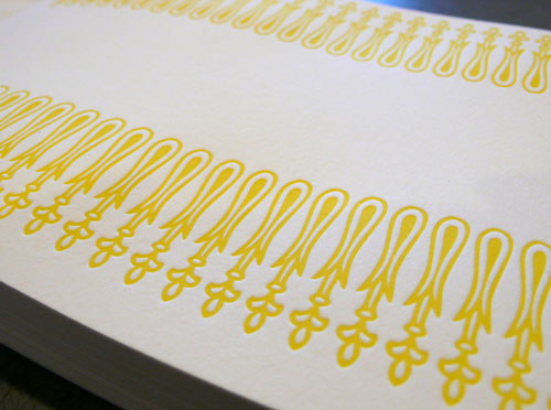
The first color yellow — I had this printed for a while, I was just waiting for the right time to print the 2nd color.

cucina1

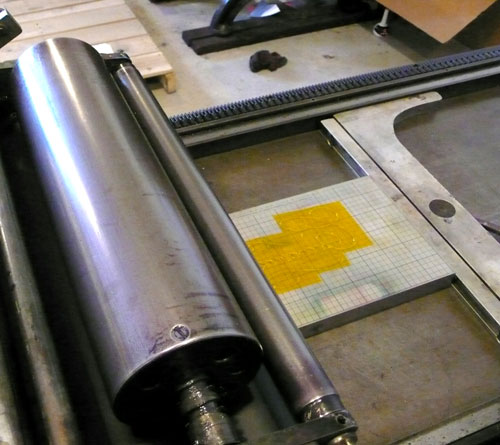
Setting up the plate and the base.

cucina3

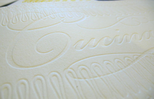
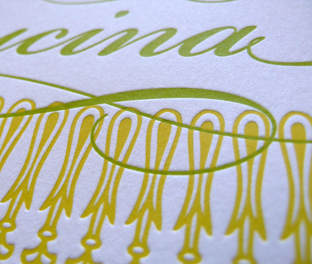
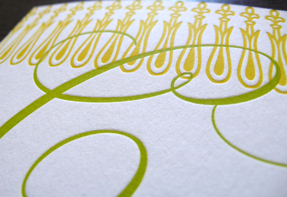
Testing the impression and the placement — adjust whatever it needs to be adjusted here. (I also love the blind impression!)

cucina2

Put the second color on the press, ready to print!

cucina4

Printing away…..

cucina5

and here it is. Now available at my etsy shop!

cucina1

cucina3

cucina4

cucina5

cucina2

Let me know what you think! :)