Just a quick shop update announcement… more Live What You Love posters are in! Please grab them as they are very limited in quantities… (it takes so long to print each one.)
Pink:
I hope your weekend will be filled with LOVE! :) Happy Friday!
Let it swim
Just a quick shop update announcement… more Live What You Love posters are in! Please grab them as they are very limited in quantities… (it takes so long to print each one.)
Pink:
I hope your weekend will be filled with LOVE! :) Happy Friday!
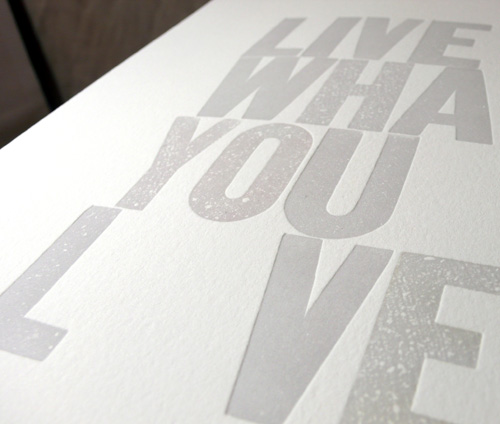
Last year, I printed the LWYL special edition in black with red heart… and this year 2010, I printed the special edition in… one of my favorite color combinations, gray with hot pink heart! I really had fun printing as the heart always makes me happy :)
Type setting without letter “O” — yup, there would be a heart there…
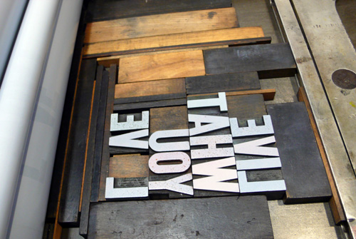
Adjusting the placement.. I love the accidental typographic art. So great.
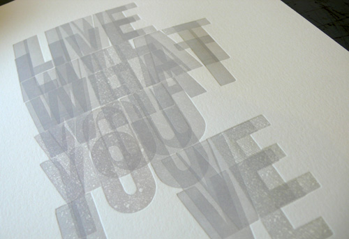
When everything is set, just print away…
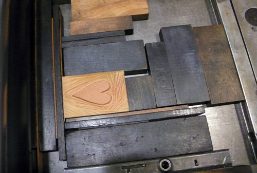
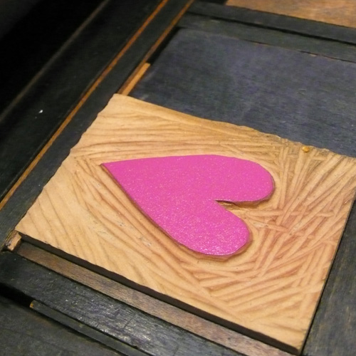
Next, set the curved linoleum heart in the place in between where the letter L and V were placed.
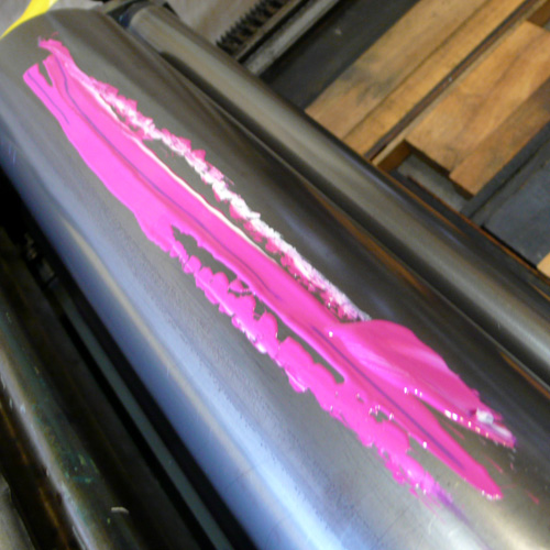
Hand mixed hot pink on the press…
a pink heart :)
Even though you thought you placed in the right place, you always have to adjust around until you have it right.
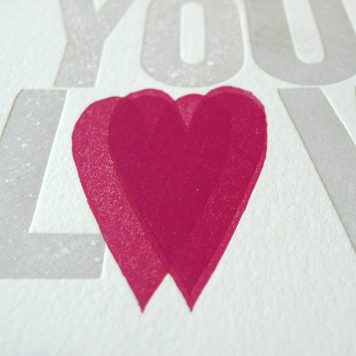
and there it is!
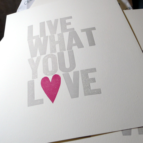
Live What You Love Special Edition 2010:
I hope you enjoy the process and the new print!
p.s I printed more orange, too… It had been out of stock for a while… but it’s back :)
Yesterday was my first day of printing in 2010! I must admit… I had missed it so much! So happy that I get to print again :)
Keep that Valentine’s Day is right around the corner (can you believe it?) in mind, I printed 4 more letterpress Alphabet Greeting cards — all LOVE themed! I really enjoyed printing them and here are some behind the scene photos…
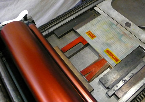
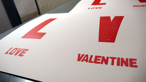
I decided to print all in red, one of my favorite colors and the color of love…
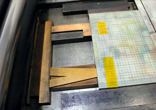
Setting wood type blocks and the polymer plates 2 at a time:
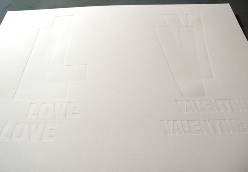
Checking impressions and adjusting placements:
Put red ink and…
print away.
2nd set — setting wood type blocks and the plates in the same position from the 1st set, but since the letters are in different width, adjusting a little here…

and print them away.
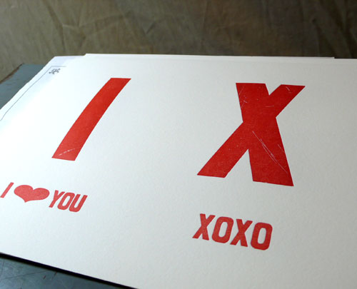
2nd color — I hand-mixed nice chocolate brown :)

Adjusting the placements… very important…
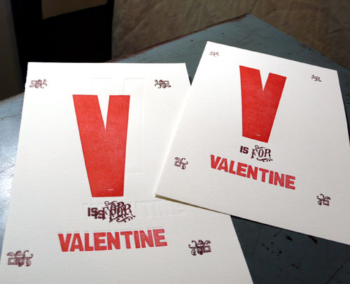
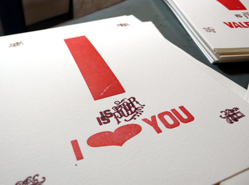
looking good :)

printing printing printing!
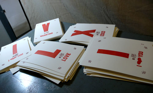
and here are the final products:
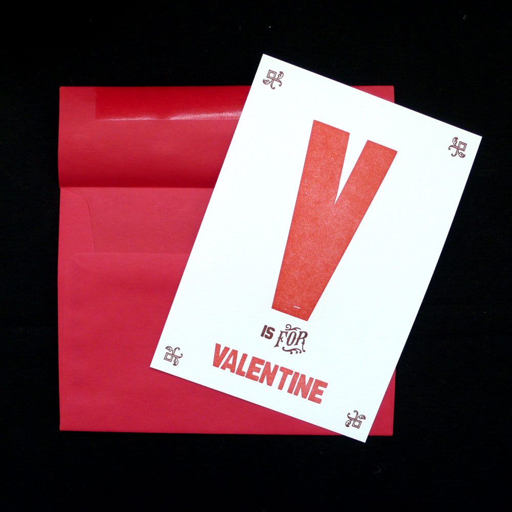
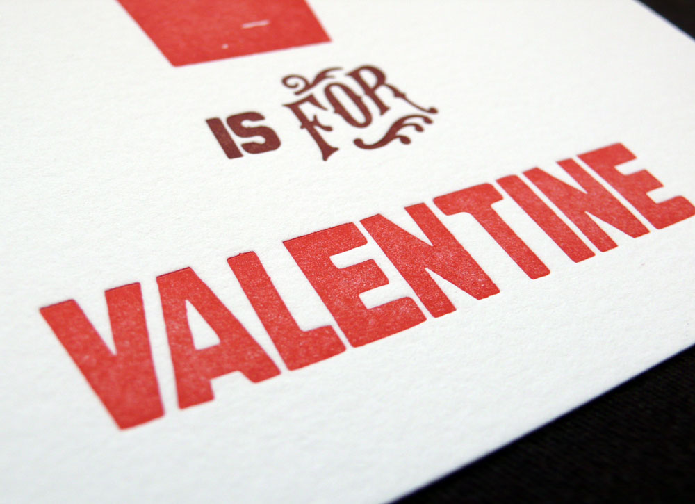
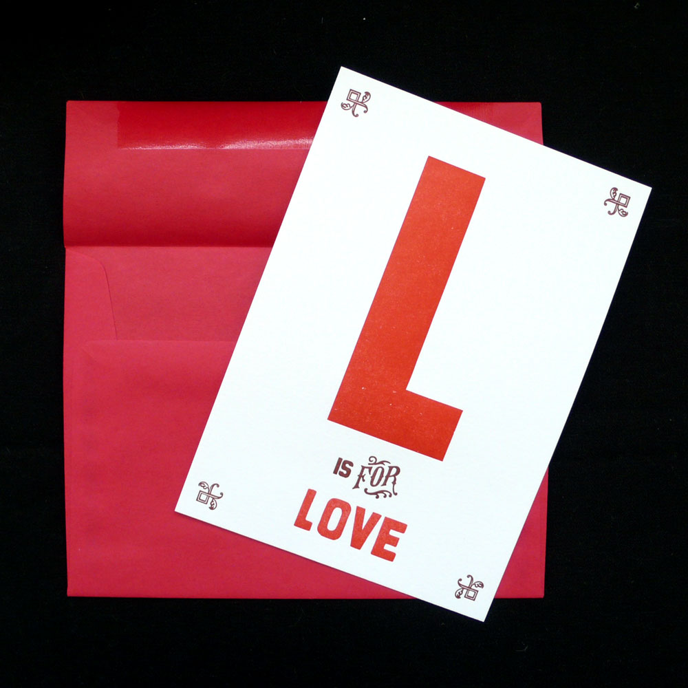

(I wanna frame this one — all the alphabet card is frame-able in US standard 5×7 frame — FYI)

Lots of nice wood type texture on letter X.

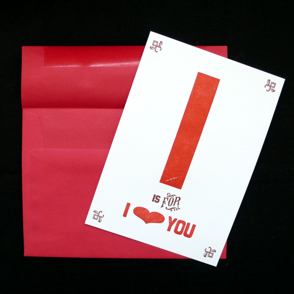
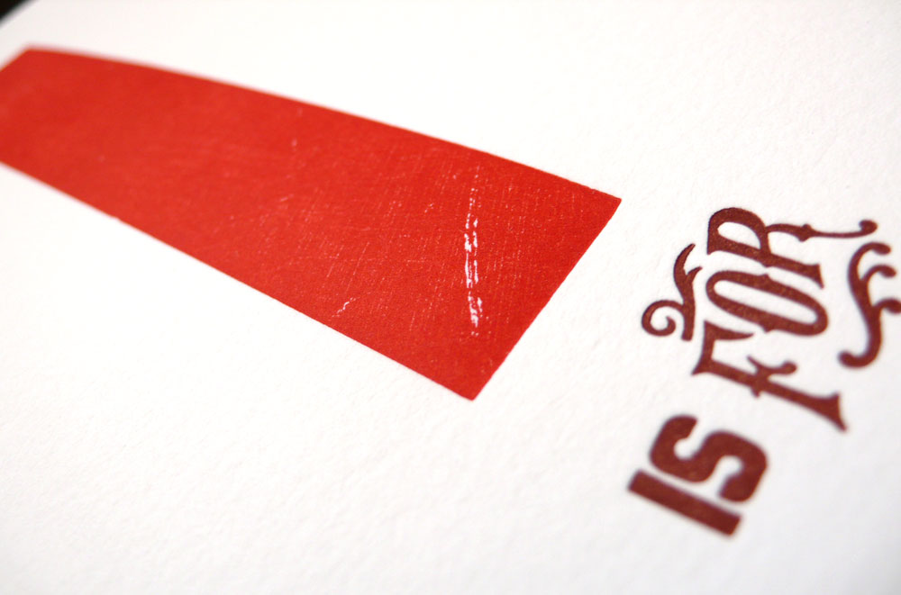
I hope you like them! :)
Hi, everyone. I am back! So good to be back, I feel refreshed and energized! So much to catch up, but I don’t feel overwhelmed (yet) :)
Just wanted to share this real quick — my work has been featured on Fossil website under Fossil. Life. Style — What We Are Into section! I am so flattered and honored to be included in these amazing group of people/work, thank you so much! When you have a second, I recommend clicking around… you may find great stuff!