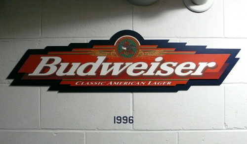
At Fenway park, I saw a wall of Budweiser logo history gallery. From way back in 1936 to 1996… I was surprised to see some of the logo design they had.
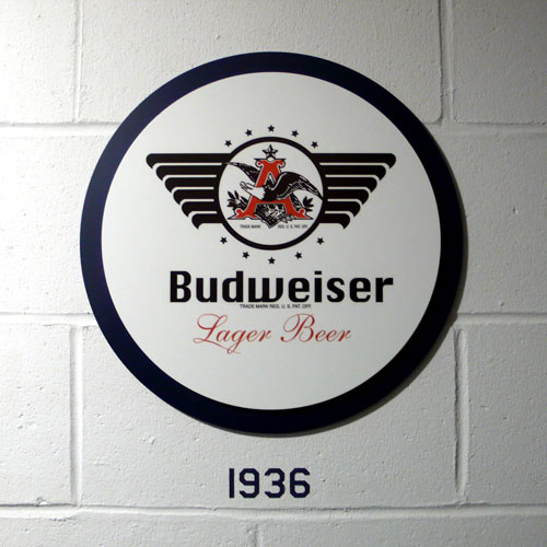
1936: I guess this was the first Budweiser logo. Very classic.
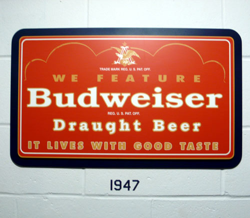
1947: They added lots of lines… it looks like an ad or something.
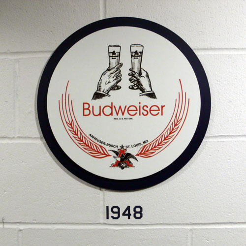
1948: Went back to simple execution. I like this one.
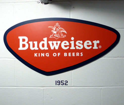
1952: Different interesting shape…
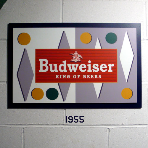
1955: How fun. I love the shapes, very retro.
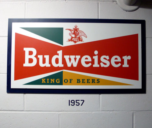
1957: Similar from the previous one, played with shapes… it looks a bit unbalance to me…?
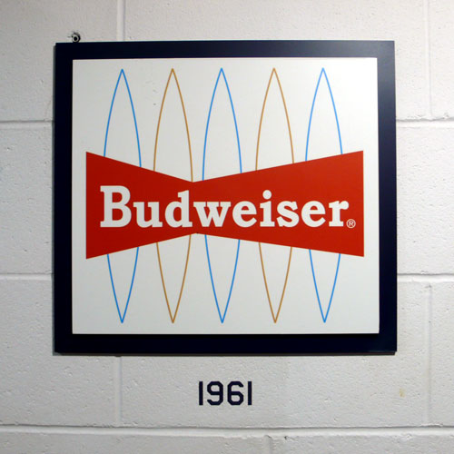
1961: This one is very retro, too. I like the line shape on the background.
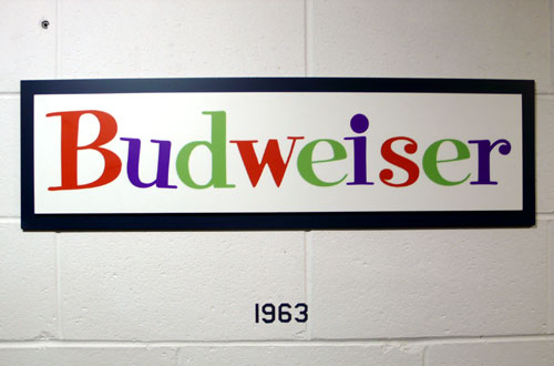
1963: this one surprises me… it doesn’t look like Budweiser / beer logo at all. Looks fun, though.
((and there was a beer booth in between here….!))
1996: I remember this one. I’m not sure what happened in between 1963 to 1996…
Thursday morning inspiration. Have a great day!
There’s something fishy going on here…
The typeface used in the 1936 version is Chicago, an Apple font from 1983!
The 1948 version uses Helvetica which wasn’t available until 1959.
I think someone tried to recreate the originals and did a pretty sloppy job.
Looks like Avant Garde in 1948, also an anachronism. 1963 looks like Jimbo, the ’90s Adobe font. Why not just scan the originals?
1948 Helvetica? looks more like Avantgarde to me (1970s)
oups, cross posting )
Hi guys-
first of all, thank you so much for visiting! so happy to know that all you design enthusiasts come visit and tell me what you think.
These are taken in Fenway park as I mentioned and there was no sign or any indications on who created these… but yeah, I wonder why they didn’t just scan the originals?!
So interesting to know the font history, too, I don’t know much about when/what year each font was created so thanks for informing!