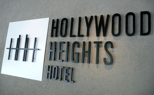
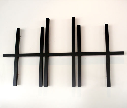
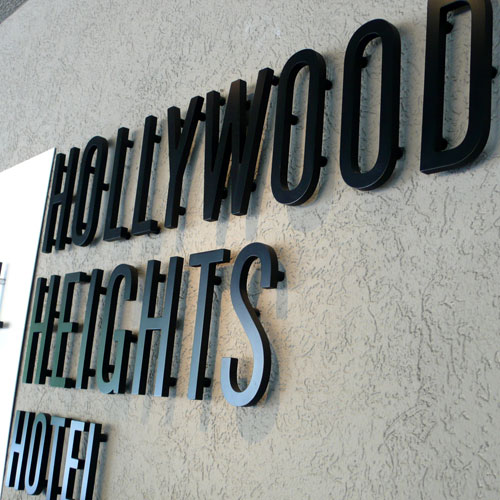
When we were in Los Angels a couple weeks ago, we stayed at Hollywood Heights Hotel for 2 nights and I couldn’t help but notice their logo. I love how they used letter H, three of them together like that, and I also love the clean condensed font for the hotel name. Very simple, modern and clever. It fits the hotel atmosphere very well. The hotel is on the hill so the logo shows around the area nicely, too, I think.


Pictures are from the front of the hotel. Love the 3D letters.
