I feel like I’ve seen this execution a lot these days, with different words and fonts played around together, nicely laid out together… or does it just keep catching my eye because I am simply drawn to typography?
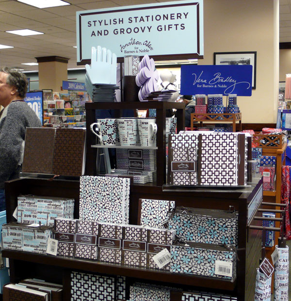
This mug cup I saw at Barnes and Noble is no exception. Love the “CAFFEINE” font.

It’s from the Jonathan Adler collection for the Barnes and Noble – Lots of fun and chic patterns and goods for your office!

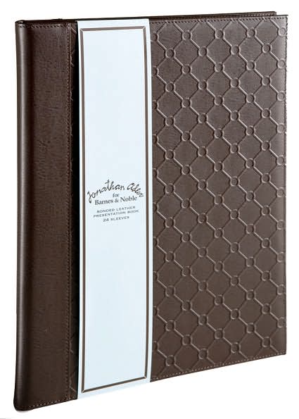
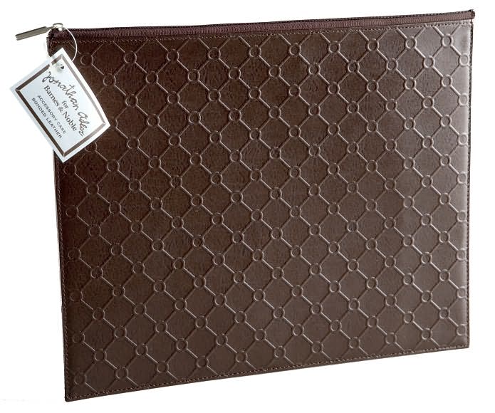
The Leather Presentation Book and Accessory Case I saw at the store are actually really nice. The pattern is embossed and so it has a nice texture and looks very chic.


love those mugs!
Hi Amy!
me, too! Cool, huh.